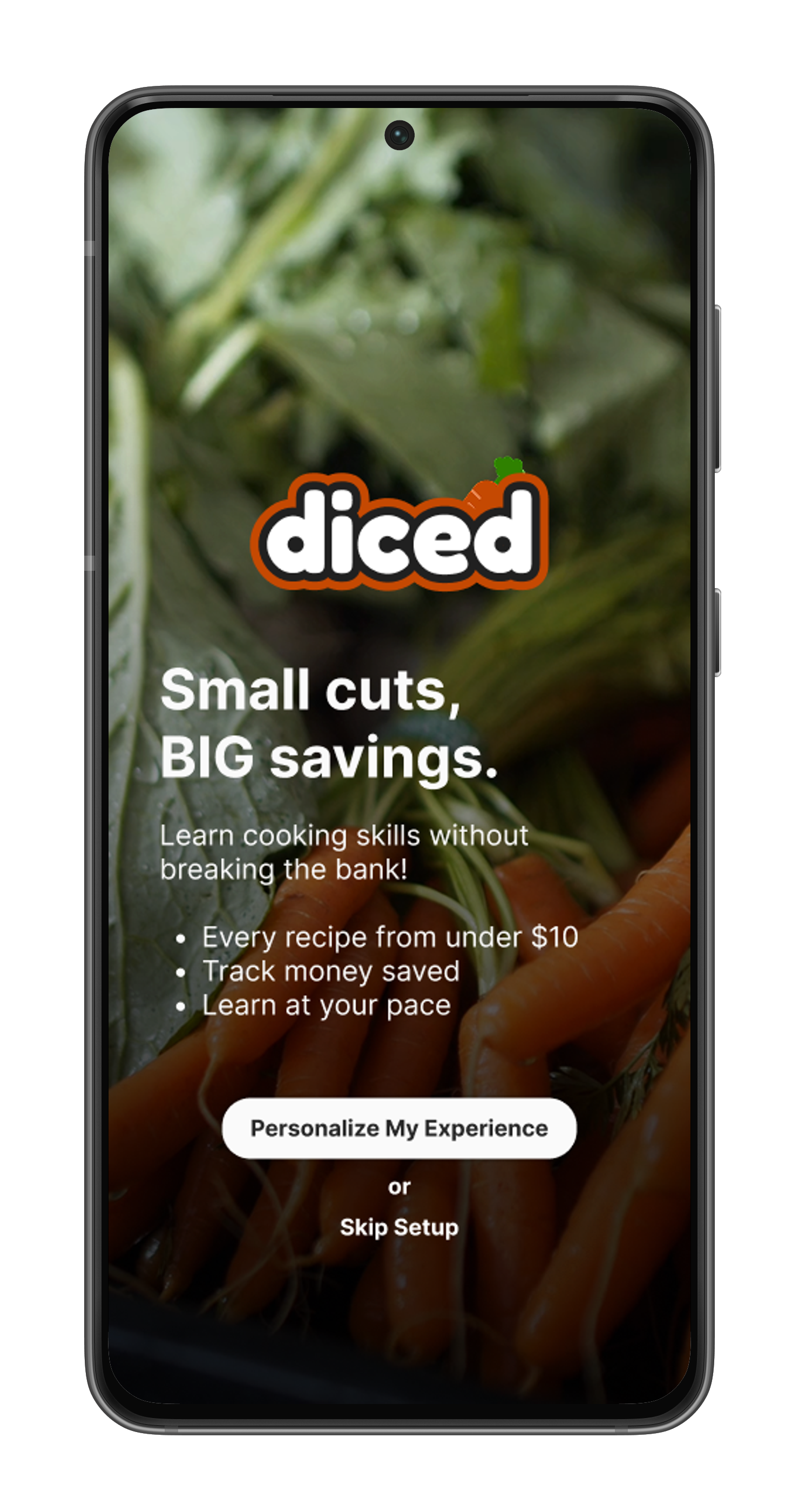
Diced
Mobile App
A practical and affordable way to learn cooking
Objective
Design an end-to-end application on a time limit. Bring a product to life: from initial concept, to branding, and finally to a full-blown app prototype.
My Role
Research
Define
Design
Testing
Team
Solo Project
Tools
Figma
Canva
Zoom
Duration
110 Hours
The Challenge
Budget-conscious home cooks face a paradox: they need to save money by cooking at home, but fear of wasting ingredients on failed recipes keeps them ordering expensive takeout instead.
This lead me to ask…
How might we create a cooking education app that guarantees users will not waste money while learning, through budget friendly practice recipes, failure recovery options, and clear progress tracking?
The Solution
Diced is a cooking education app that helps home cooks master essential culinary skills through affordable practice recipes.
By combining bite-sized skill lessons with recipes under $10, Diced removes the financial anxiety that prevents people from expanding their cooking abilities.
Budget friendly practice recipes (under $10)
Built-in failure recovery options
Transparent progress tracking
-
Competitive Analysis
User Interviews
Originally, I aimed to see if users wanted a solution for using leftover ingredients to reduce waste and save money. However, inital user interviews revealed people already had strategies, from meal planning to re-purposing ingredients or ordering takeout.
This led to my first pivot: a gamified education app to address users' lack of cooking skills and confidence.
Preface
I explored 3 products designed to improve cooking skills, plus Duolingo to understand gamified learning.
Competitor analysis revealed gaps in the cooking education app market—existing apps focused on recipes or techniques but ignored users' financial concerns about learning.
Competitive Analysis

Click to view full image
I interviewed 5 individuals, ranging from young professionals to established adults, each with diverse cooking abilities and eating habits. Over 40-minute sessions, I explored their motivations, goals, and routines to validate my research objective:
Test receptivity to a gamified cooking education solution focusing on skill-building and cooking confidence development.
The interviews showed that while confidence was an issue, it wasn't the main hurdle. The breakthrough came when I discovered the real barrier: 60% of users avoided new recipes due to fear of wasting money on failed attempts, not lack of confidence.
User Interviews
Practical skills with clear outcomes — Not abstract confidence.
Budget-conscious learning — An accessible way to learn cooking.
Flexible Learning — Over daily commitment.
Clear Outcomes — Progress tracking.
This led to my final positioning:
"Master essential cooking skills through budget-friendly practice recipes."
By addressing financial anxiety first (budget-friendly recipes, failure recovery), users can naturally build both skills and confidence.
-
Personas
Storyboard
Feature Set
Sitemap
User Flows
Personas
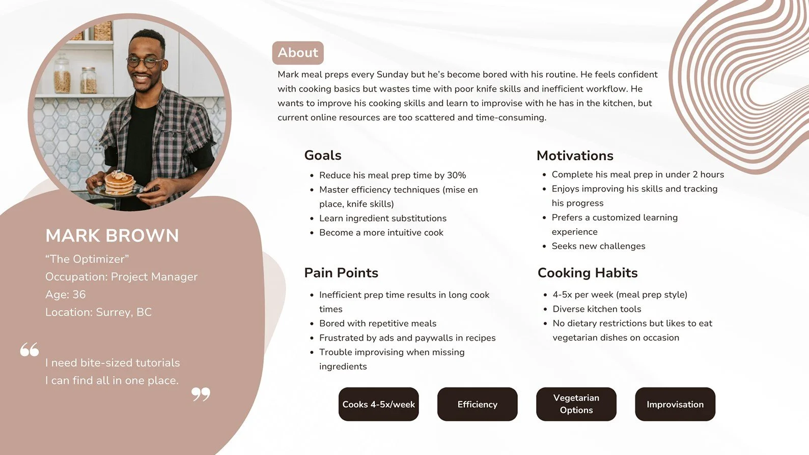
Using my the insights I gained from my research, two personas emerged to represent the my potential users.
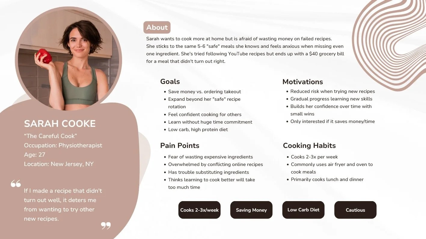
Using my persona Sarah, I created a storyboard to help visualize her cooking journey through Diced.
She uses features such as budget friendly practice recipes, quick fixes, and progress tracking which help address her financial anxiety throughout the learning journey.
Storyboard

Click to view full image
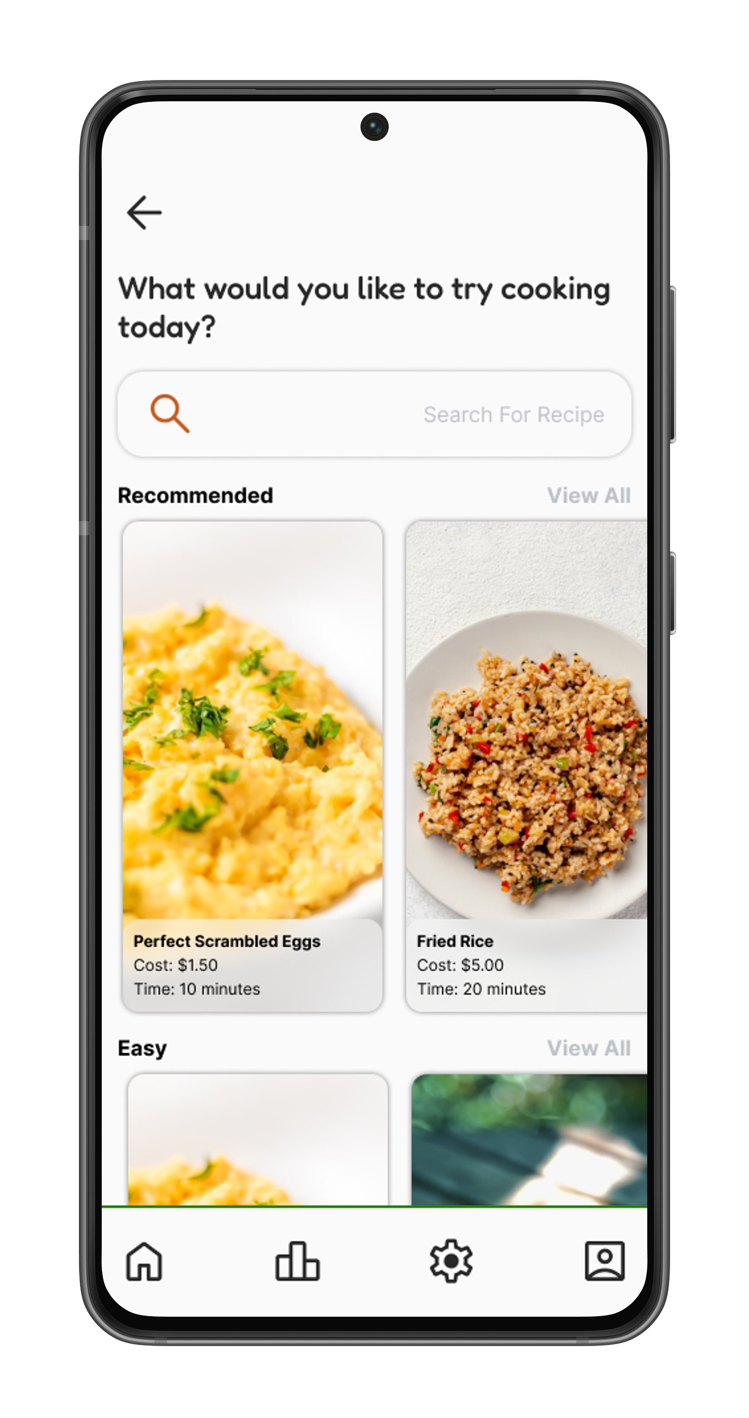
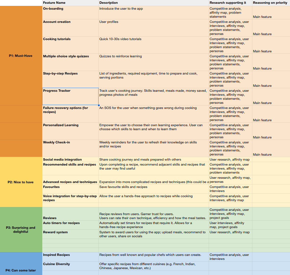
Feature Set
Personalized learning, step-by-step recipes, progress tracking, and failure recovery were the intended core features. I prioritized their implementation, along with other key functionalities, by balancing research insights with project time and effort constraints.
I designed a sitemap to visualize how the user will navigate the app, while prioritizing an easy-to-understand flow and clear hierarchy.
Sitemap

Click to view full image
To understand potential user decisions, I developed user flows for the main application features: onboarding, lessons, practice recipes, and progress tracking.
User Flows

Click to view full image
-
Low-Fidelity Wireframes
Mid-Fidelity Wireframes
Branding
UI Kit
High Fidelity Wireframes
I began sketching the initial components of the product, incorporating key elements from the sitemap and user flows.
This process allowed me to quickly explore multiple iterations before selecting the designs to be digitized.
Low-Fidelity Wireframes
-
![]()
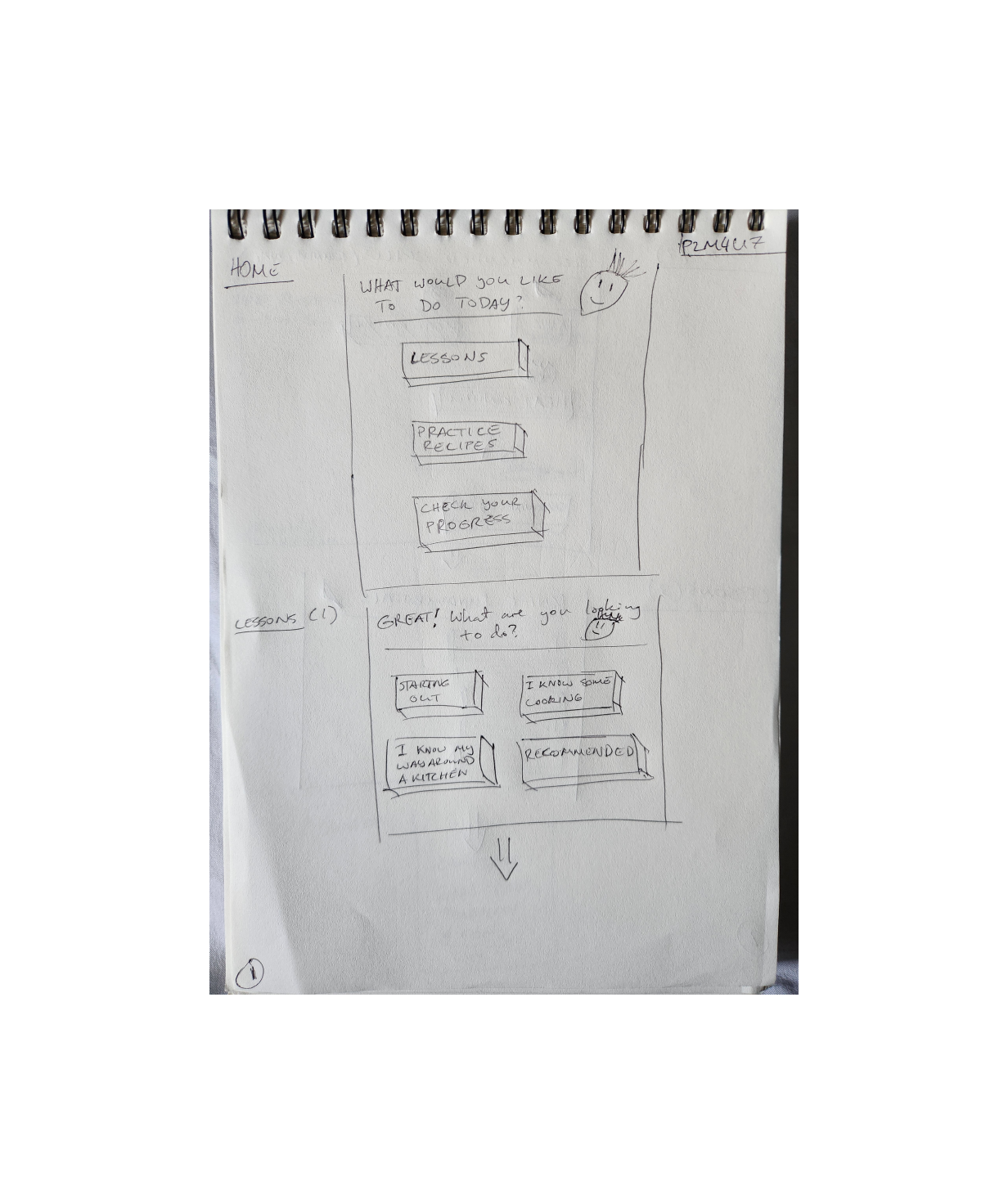
Home Page/Lessons (1)
-
![]()
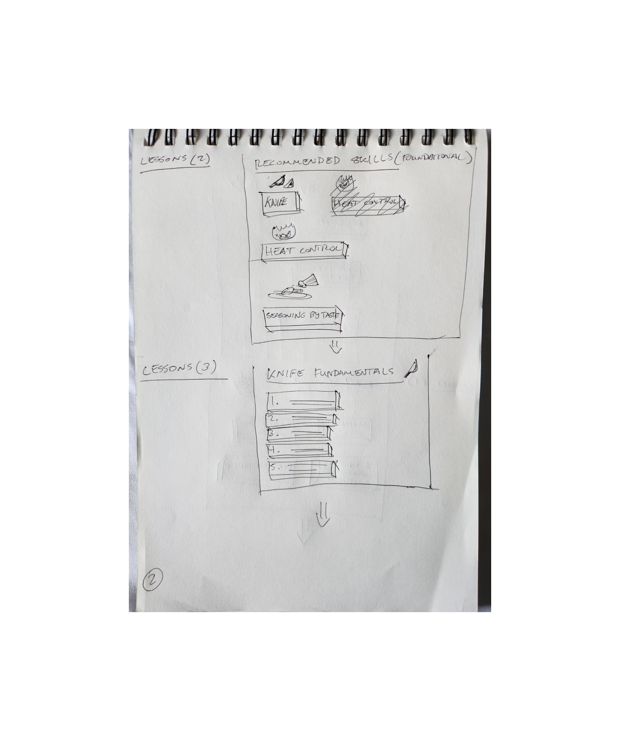
Lessons (2,3)
-
![]()
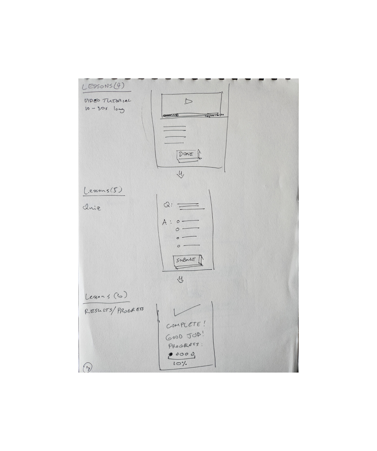
Lessons (4,5,6)
-
![]()
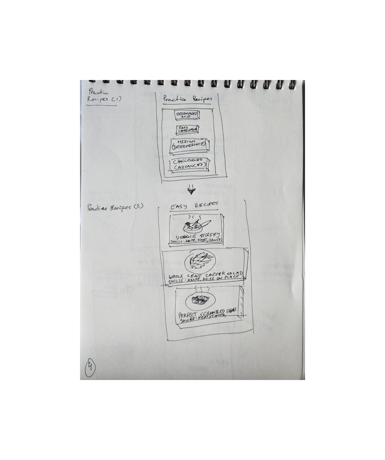
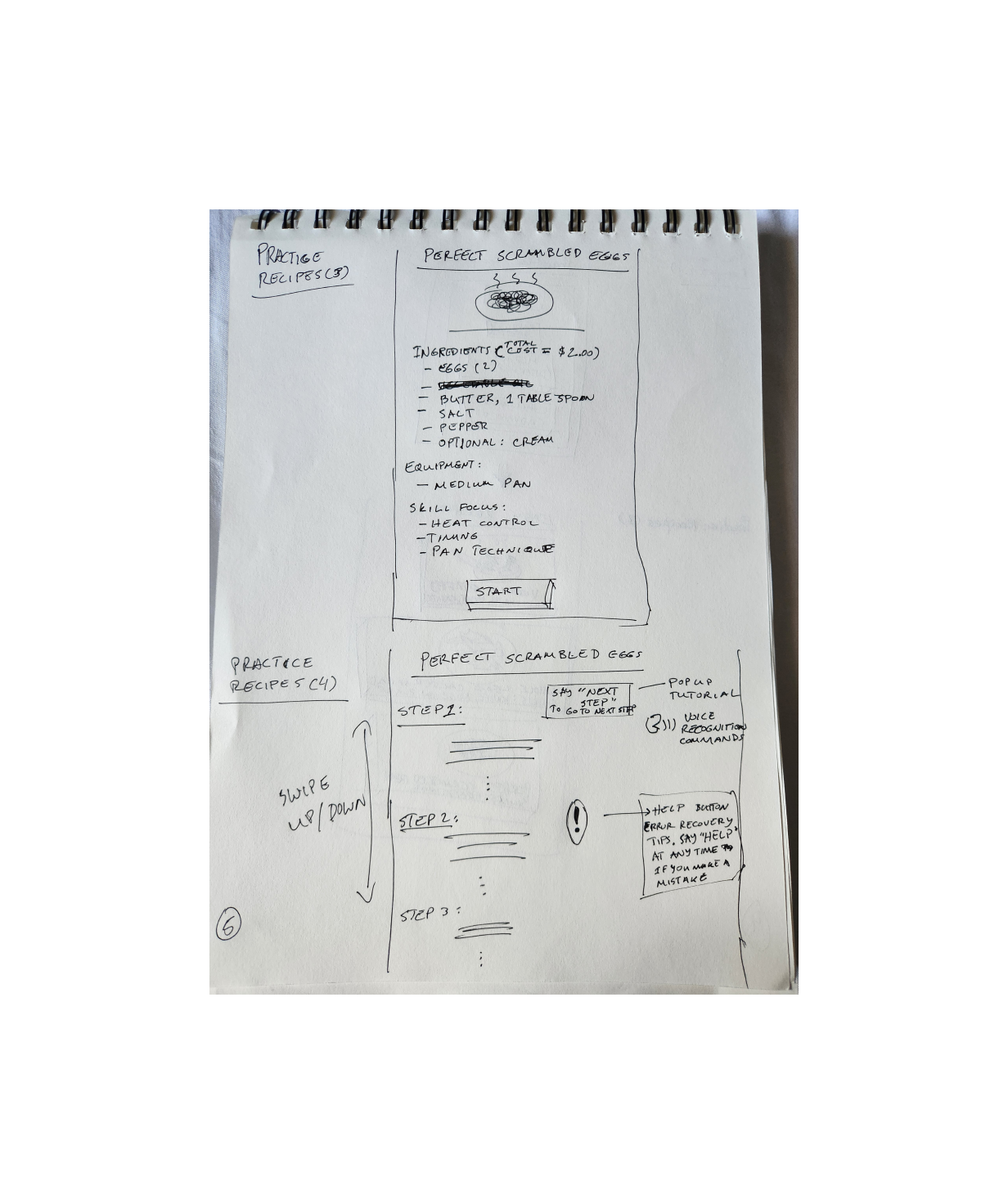
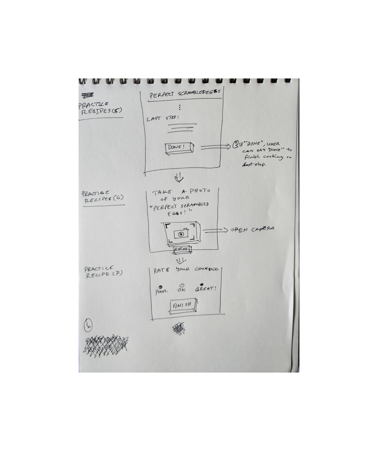
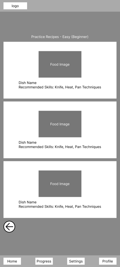
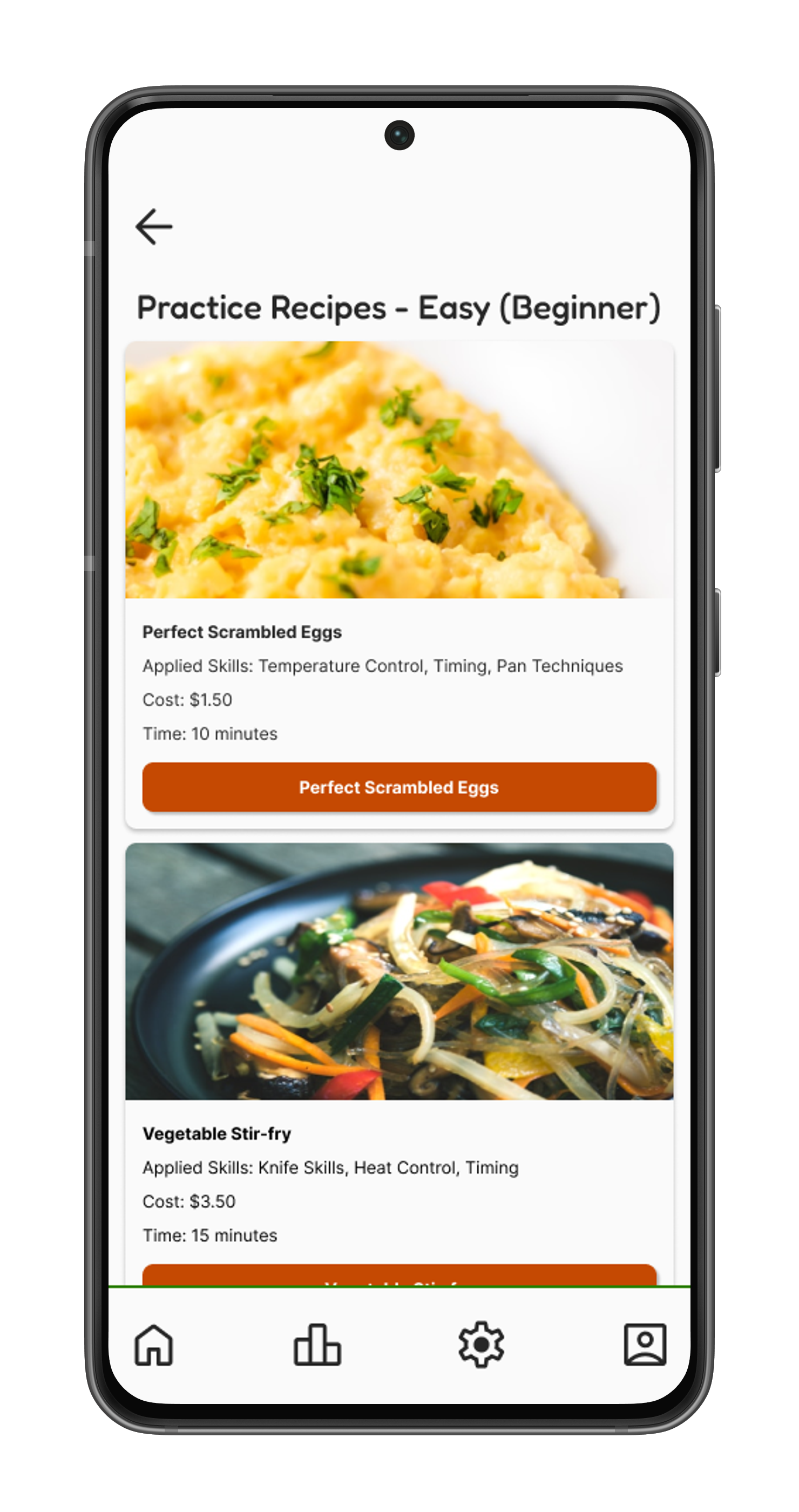
Practice Recipes (1,2)
-
![]()
Lessons(5)/Recipes(1)
-
![]()
Practice Recipe (3,4)
-
![]()
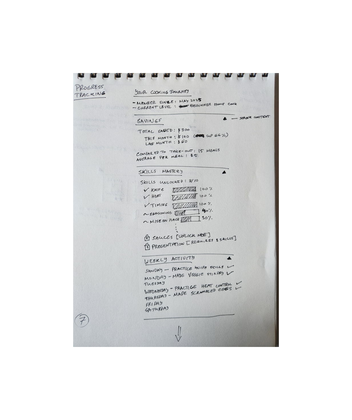
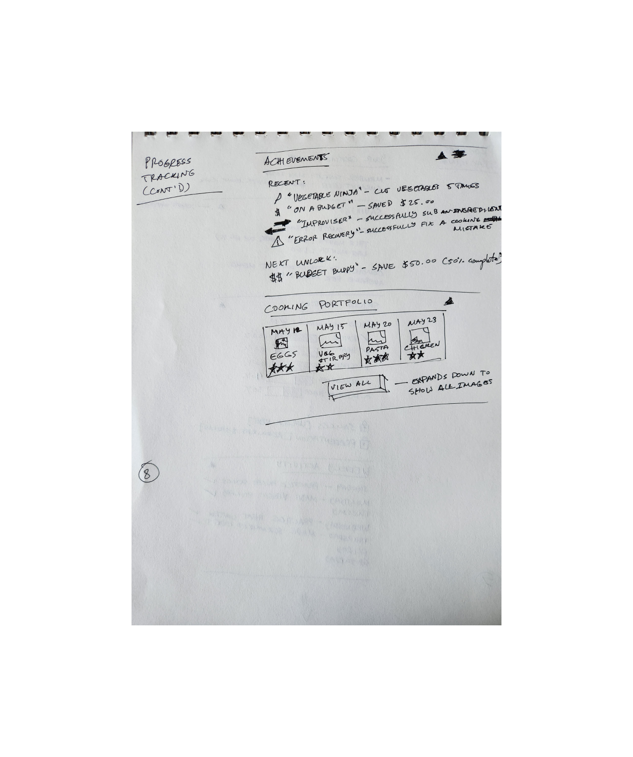
Progress Tracking (1)
-
![]()
Progress Tracking (2)
My mid-fidelity wireframes and UI kit streamlined the creation of high-fidelity screens.
Initial designs featured lighter orange and green hues, which I adjusted due to accessibility concerns.
Mid-Fidelity Wireframes
-
![]()
Onboarding
-
![]()
Home
-
![]()
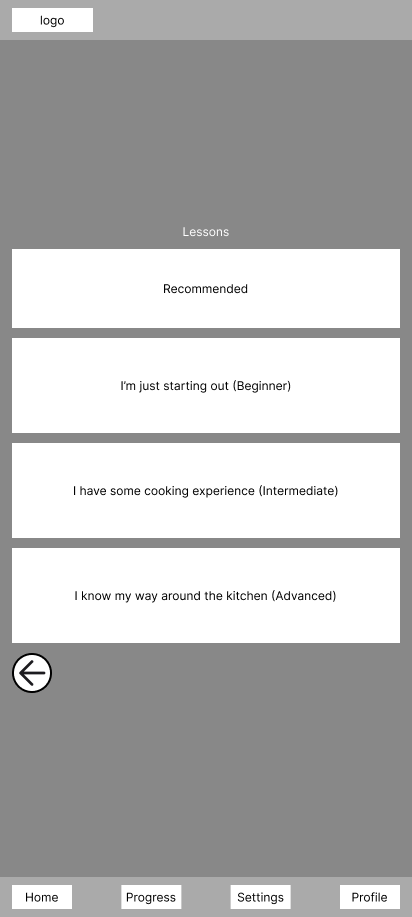
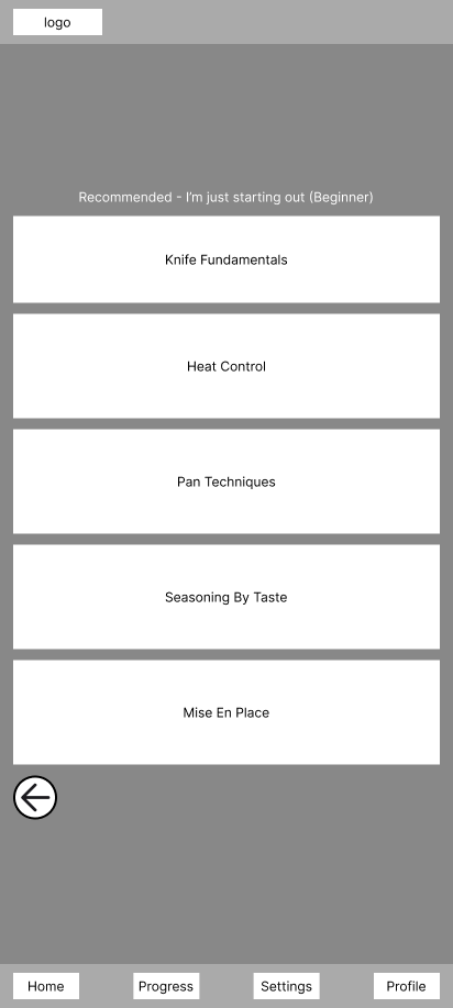
Lessons
-
![]()
Lessons (cont’d)
-
![]()
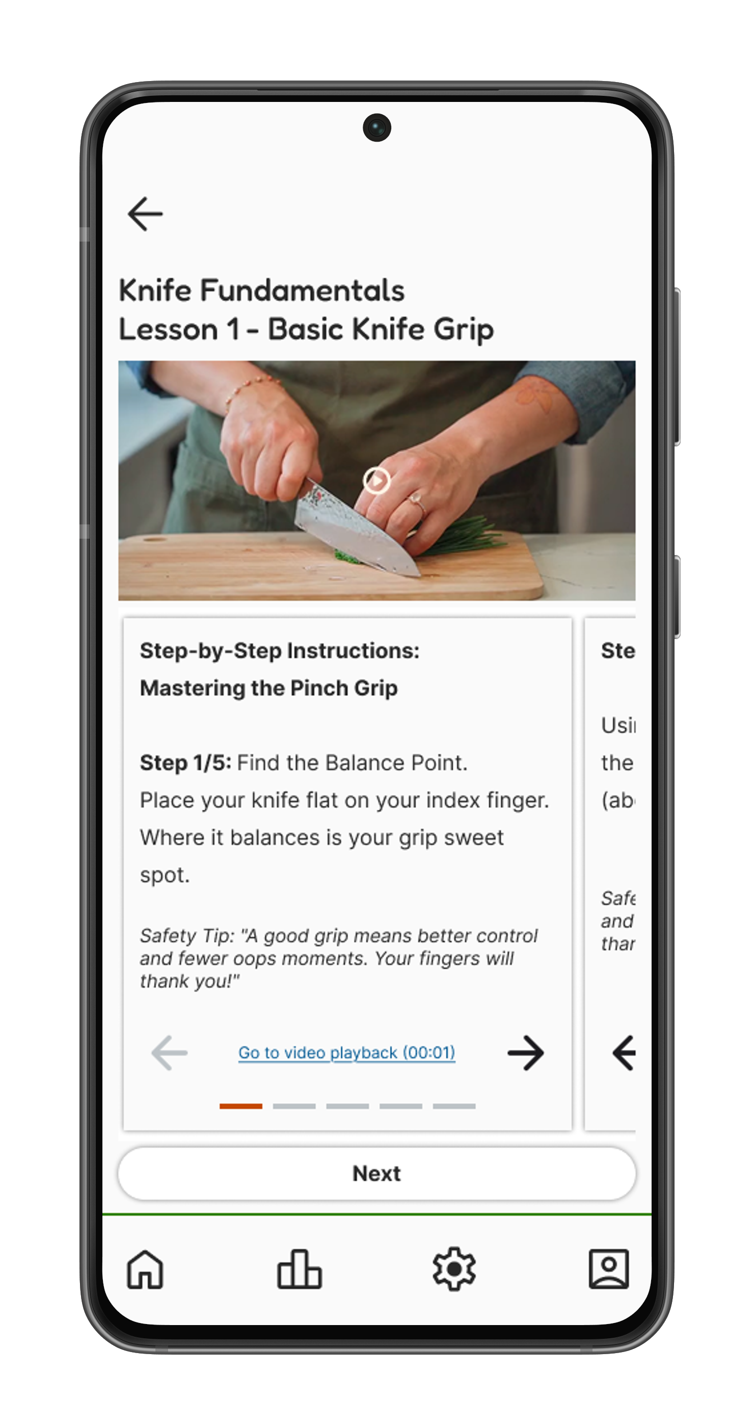
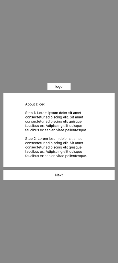
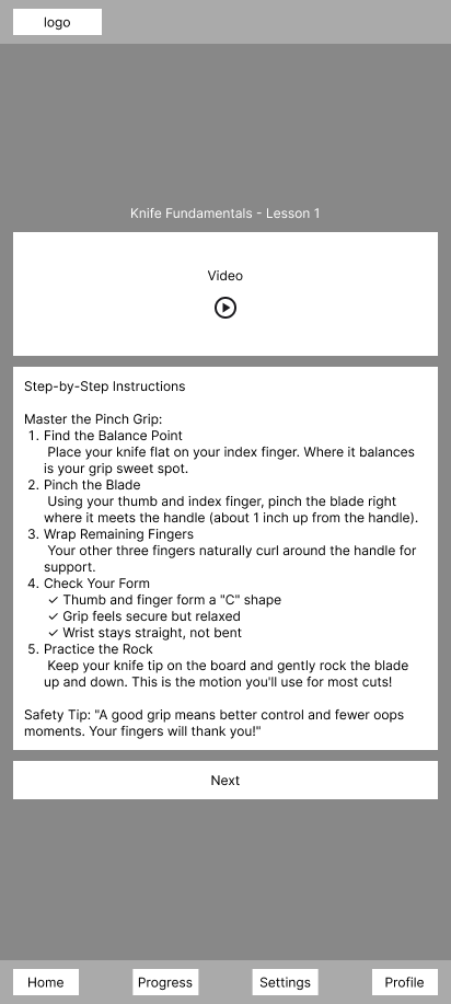
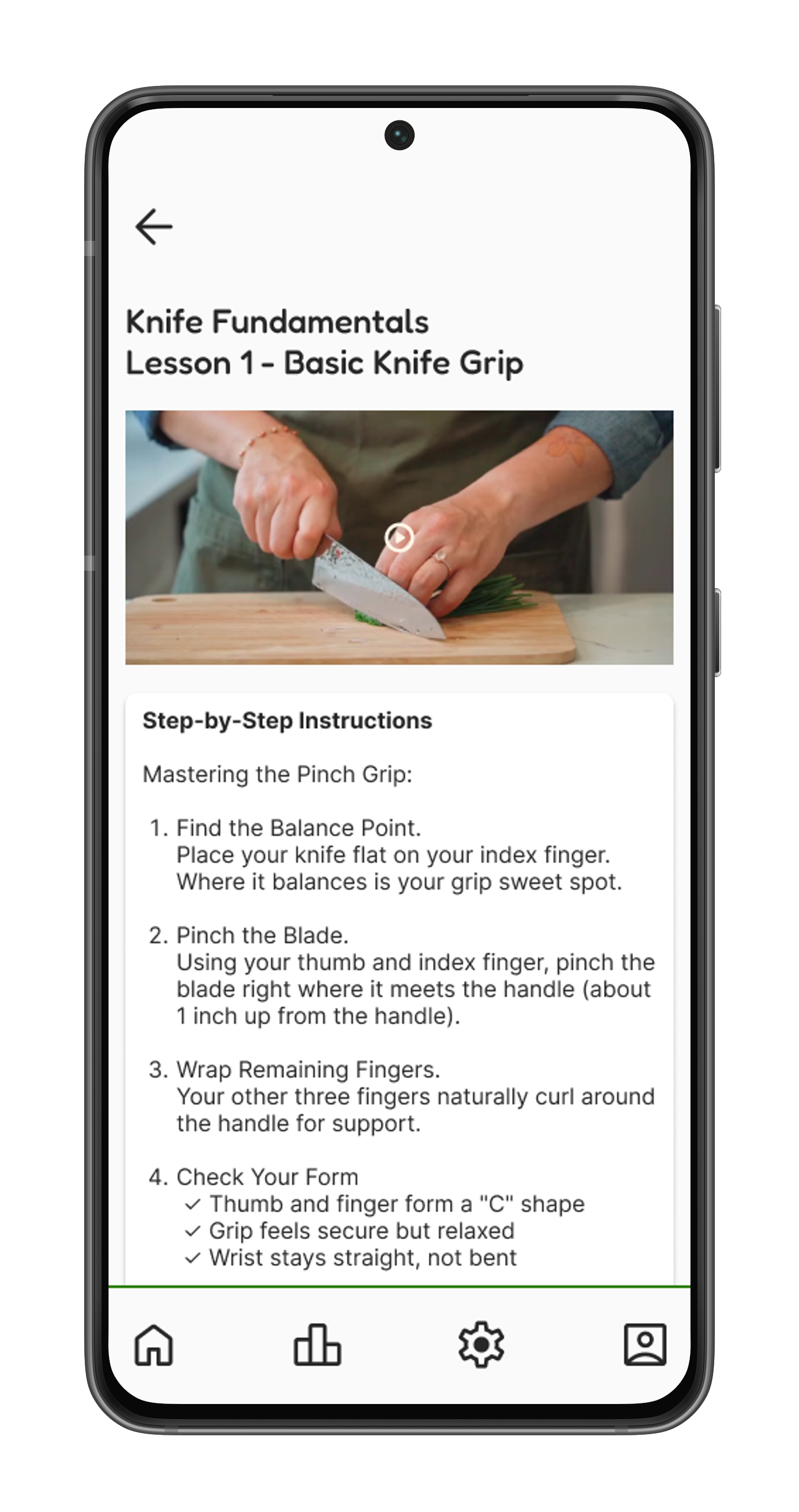
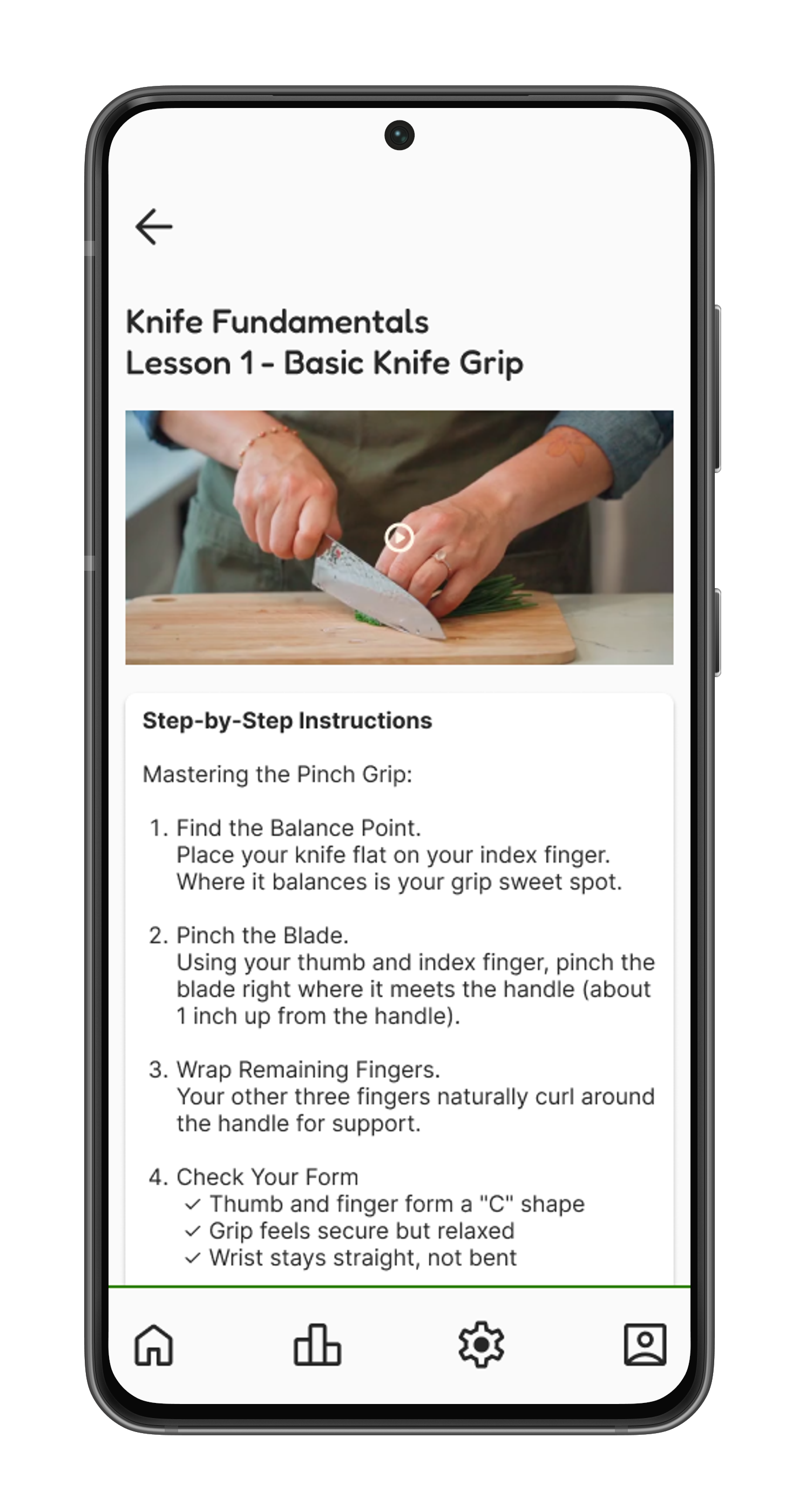
Lesson - Knife Fundamentals
-
![]()
Recipes
-
![]()
Recipe - Step 1


I envisioned a carrot logo/mascot for this project and my exploration of cooking techniques for brand names led me to "Diced," a name that cleverly ties into the many ways carrots can be cut.
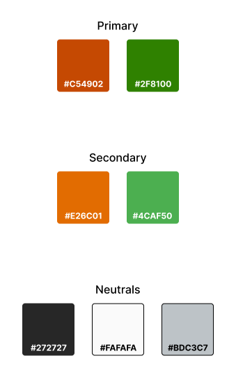
Branding
I chose orange and green for the branding, which are also colours commonly associated with carrots. They reflect the project's educational focus: orange for optimistic and approachable energy, and green for growth and progression.
UI Kit

A UI kit was instrumental in keeping my design consistent throughout the project.
Click to view full image
The features onboarding, lessons and practice recipes were digitized to mid-fidelity wireframes. Unfortunately, due to time constraints I made the decision to not bring over progress tracking.
High-Fidelity Wireframes
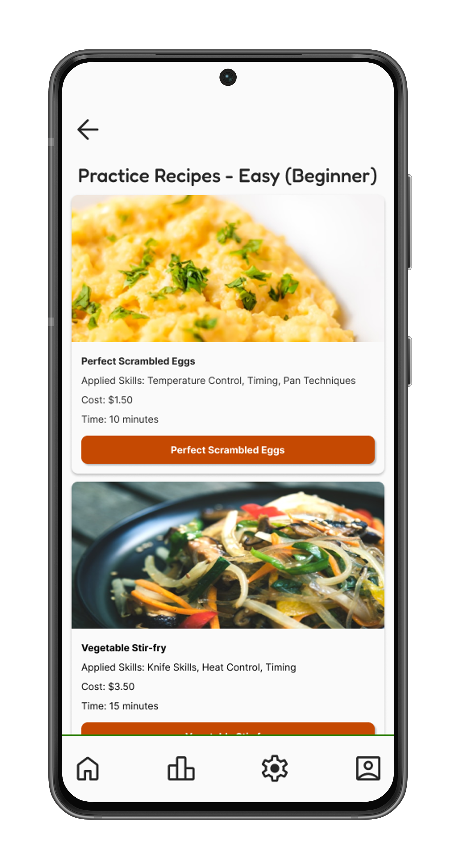
Recipe List

Step-By-Step Recipe Guide
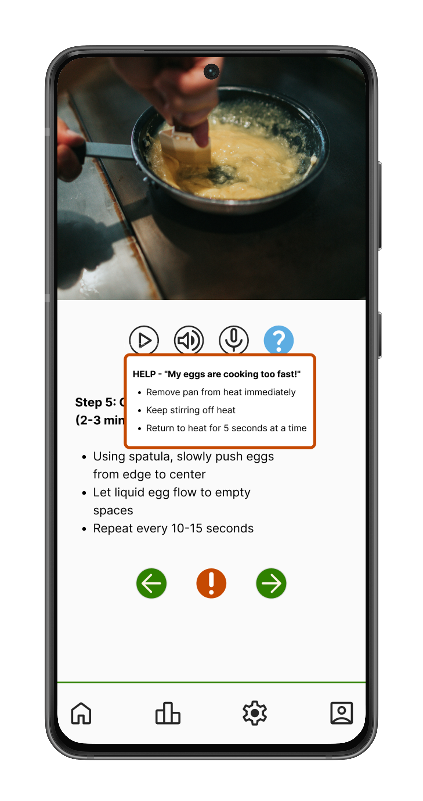
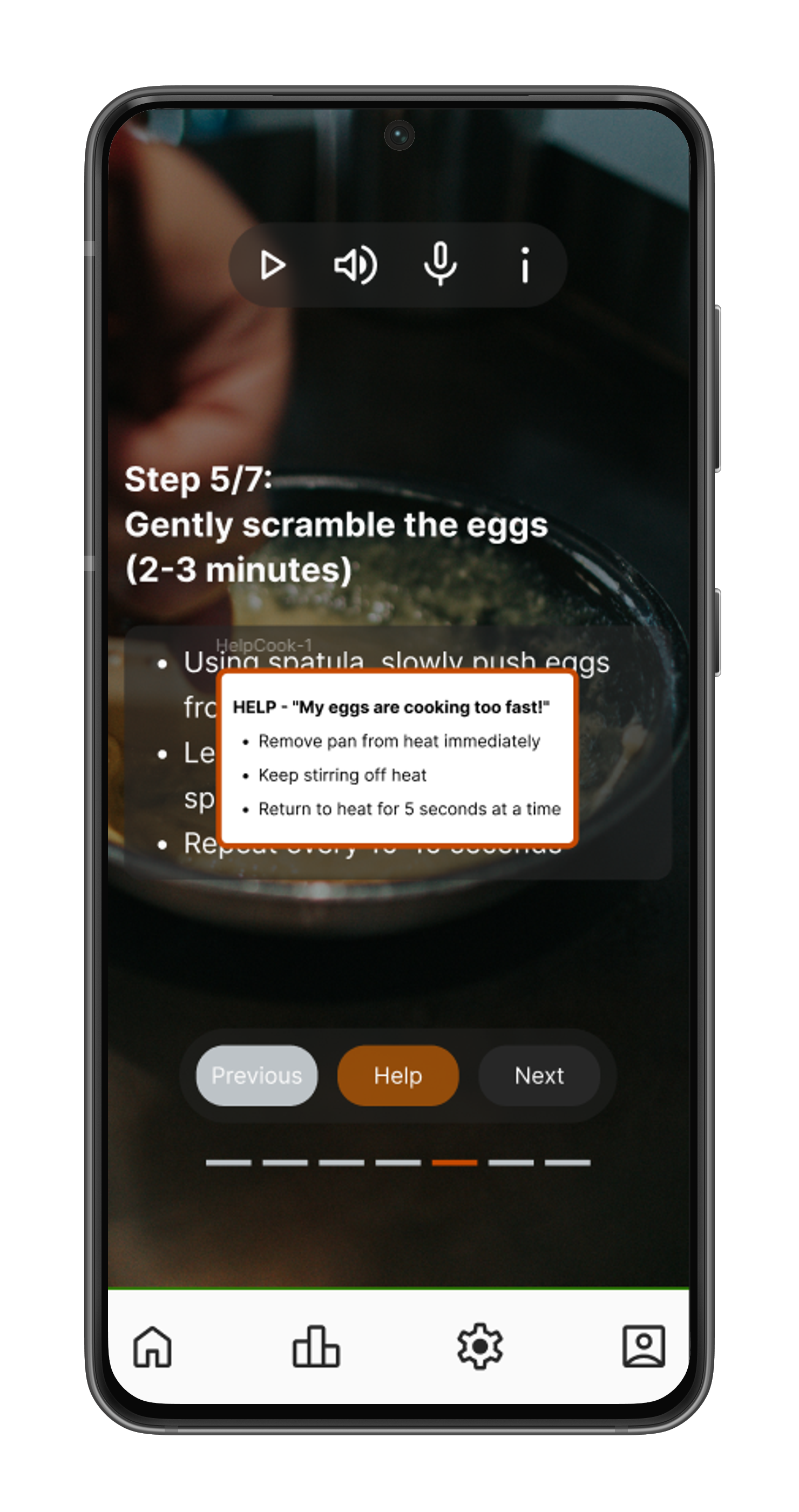
Error Recovery Feature

Welcome
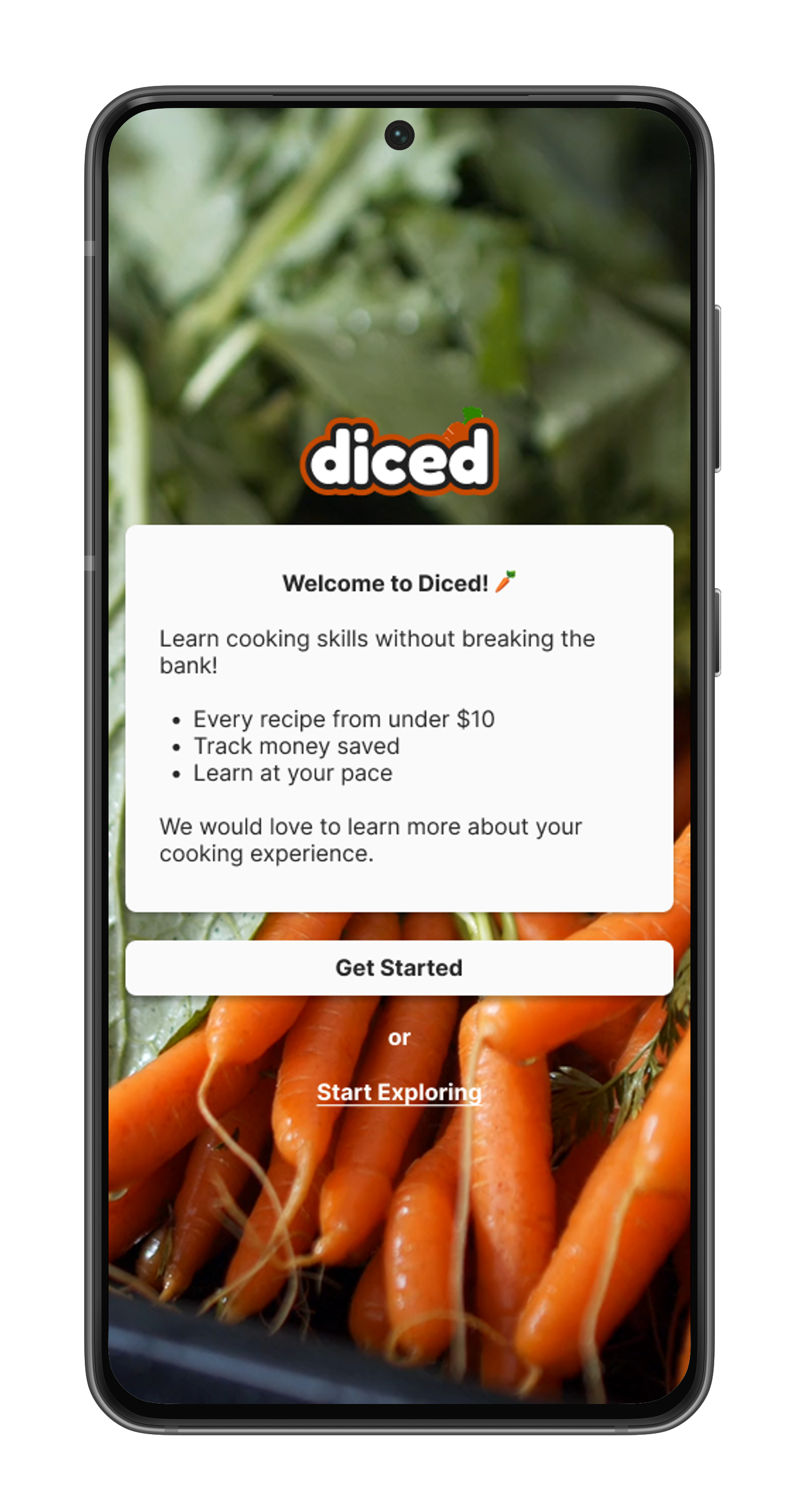
Home
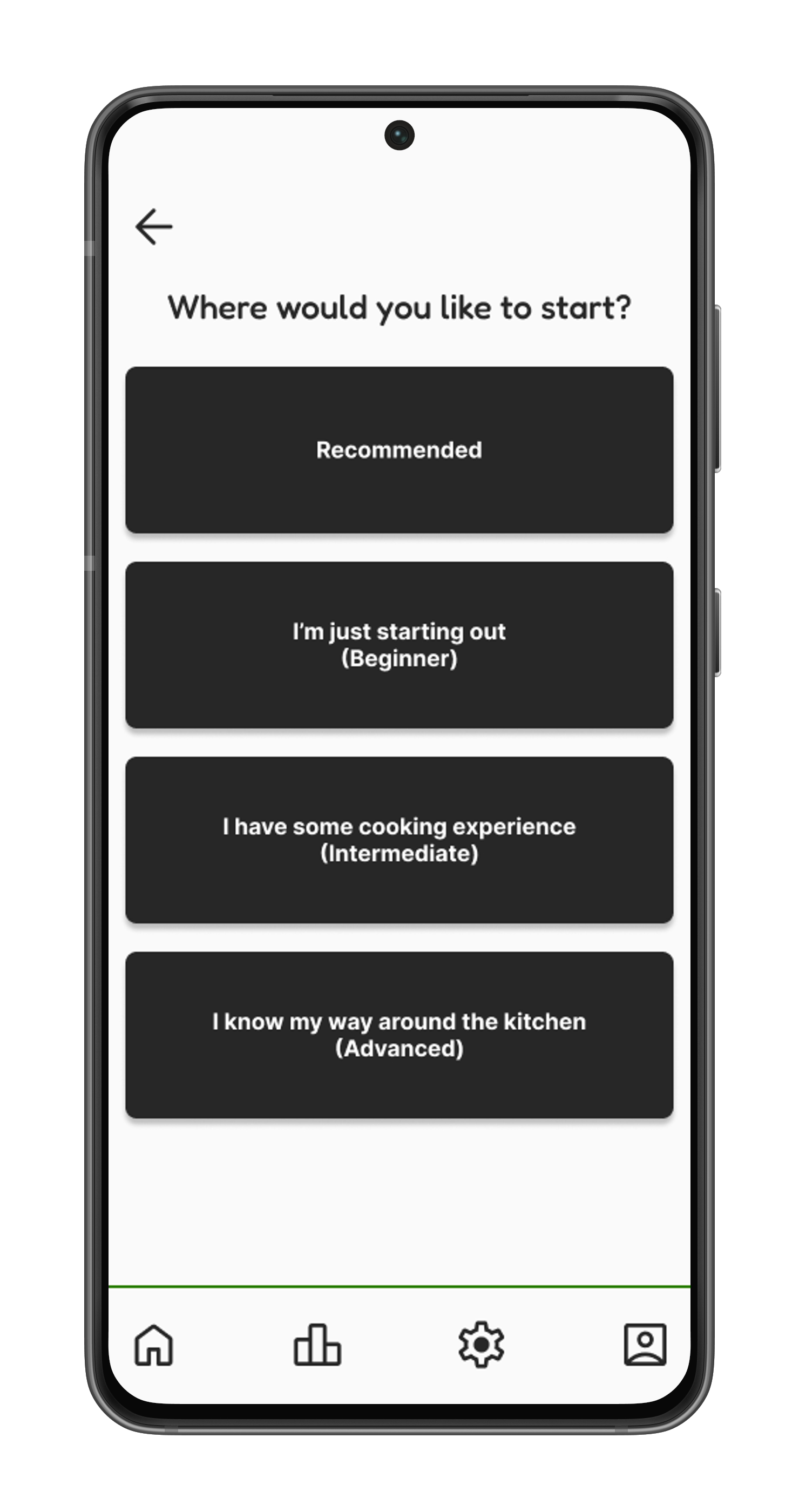
Difficulty Options
Lesson Guide
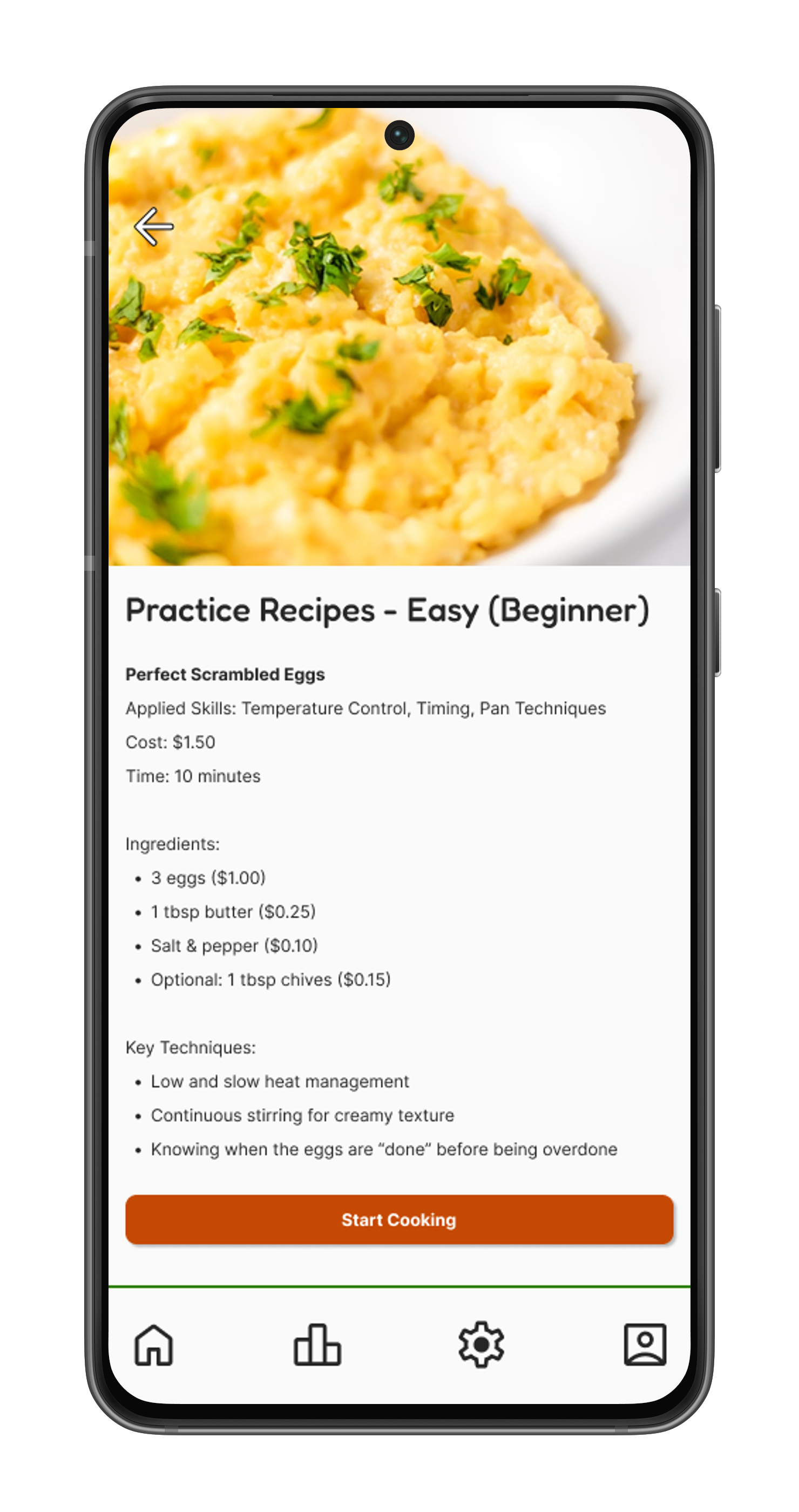
Recipe - Scrambled Eggs
-
Usability Testing
Iterations
Reflections/Next Steps
Prototype
I conducted moderated remote usability tests with five participants who represented a range of cooking abilities, routines, and habits. Each session involved participants interacting with a Figma prototype and were encouraged to think aloud as they completed the following tasks:
Usability Testing
Task 1: Learn about beginner knife fundamentals
Prompt: "Find and start a beginner lesson about ‘knife fundamentals’ skills, go through the lesson called 'The Basic Knife Grip' and tell me what you think as you go."
Task 2: Try the scrambled eggs practice recipe
Prompt: "Find the Scrambled Eggs recipe - it should be under beginner recipes. Before you start cooking, review the recipe. Pay special attention to how much this recipe will cost you. Now start following the recipe and complete the first 4 steps."
Task 3: Find in-app help while cooking
Prompt: "You're on Step 5, now imagine your eggs are sticking to the pan. You're worried you're ruining them. See if the app can help you fix this problem. Explore what options are available when things don't go as planned."
Task 4: Complete the scrambled eggs recipe
Prompt: "…Now continue with the recipe and complete it. Tell me how you feel about the experience as you go through the remaining steps."
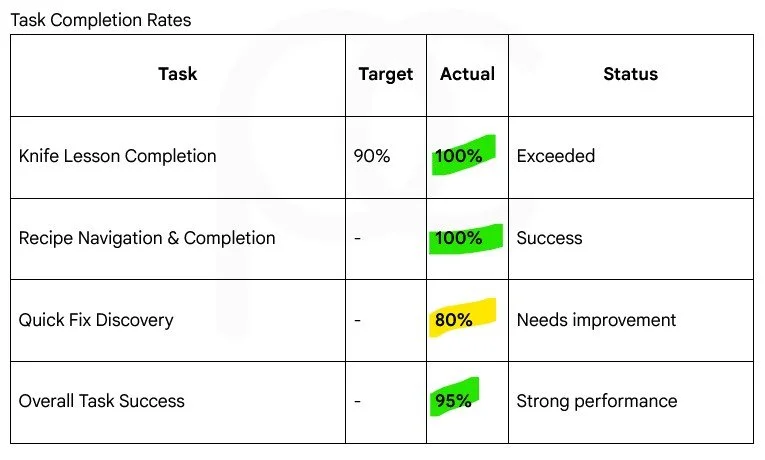
Key Successes ✅
Price Transparency: 5/5 users praised the visible recipe costs
Clean Visual Design: Described as "simple," "easy to follow," and "not distracting"
Quick Fix Feature: Once discovered, users found it valuable for reducing cooking anxiety
Step-by-Step Format: Clear progression through recipes was universally appreciated
Post-Recipe Food Photo: All user’s were pleasantly surprised of this feature
The usability testing of the Diced cooking education app revealed strong market validation with an average satisfaction score of 8.6/10 and 100% task completion for core features (lessons and step-by-step recipes).
One participant required assistance finding the quick-fix button but was able to complete the tasks after. Additionally, the app's budget-conscious positioning resonated strongly with all participants.
Critical Issues to Address ⚠️
High Priority
Help Button Invisibility - 4/5 users failed to recognize the "!" icon as help
Low effort fix with high impact on user safety net
Mobile Navigation Failures - 3/5 users experienced blocking issues
Prototype responsiveness needs to be fixed
Mid-Priority
Missing Progress Indicators - 4/5 users felt disoriented without progress tracking
Text-Heavy Skill Lessons - 3/5 users found lessons overwhelming with text
Low Priority
Lack of Visual Personality - 4/5 users suggested adding emojis/icons
Aside from the most critical issues to address, I revisited the general look and feel of the app.
I updated many styles, moving from filled and stroked designs to shading techniques for a more modern aesthetic.
Revisions
Original

Revision
⚠️ Problem (Figure 3):
Many users found the lessons section to be too text heavy.
Users also found themselves disoriented throughout the flow of the app.
Figure 3
⚠️ Problem (Figure 5):
Users suggested adding emojis to add some visual personality
✅ Solution (Figure 4):
Separate each step into a bite size sections.
Add progress bars throughout the app.

Figure 4
✅ Solution (Figure 6):
Added emojis throughout the app.
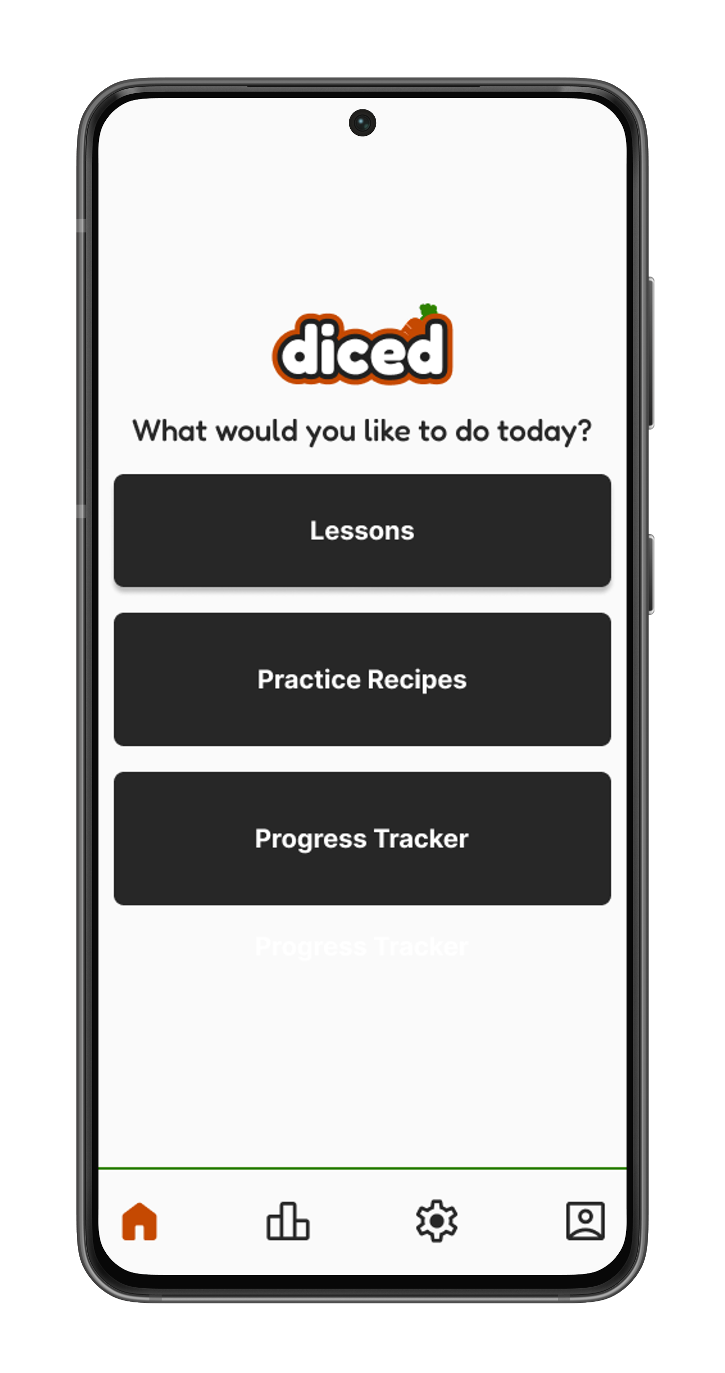
Figure 5
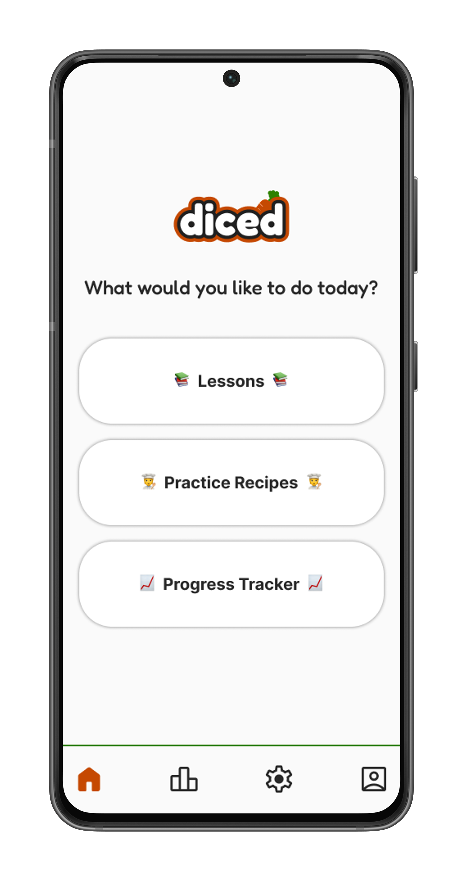
Figure 6
⚠️ Problem (Figure 1):
Majority of the users failed to recognize the ‘!’ icon for help.

Figure 1
✅ Solution (Figure 2):
Change ‘!’ to ‘Help’ for improved clarity.
Figure 2
Key Takeaways
I learned that revisiting research to build a stronger foundation is not only acceptable but essential for informed design decisions.
This iterative approach prevents costly missteps and ensures solutions are truly user-centered and evidence-based.
Recognizing that my initial designs were not as strong as originally anticipated, I embraced multiple iterations to achieve a more modern and enhanced aesthetic.
This process not only resulted in a significantly improved design but also strengthened my UX skills through hands-on refinement and critical evaluation.
The breadth of work required for this project allowed me to practice skills I had not utilized in previous projects, specifically logo design and UI kit development.
These new challenges significantly expanded my design toolkit and confidence in tackling holistic design projects.
Pinpointing a Core Topic
This project taught me the importance of following research findings, even when they challenge initial assumptions. It is crucial to embrace iteration and to accept research results that may prove original ideas wrong.
Swapping A’s - Aesthetic for Accessibility
I initially gravitated towards lighter shades of orange and green, but realized this conflicted with accessibility standards. To address this, I opted for darker shades of orange and green for the primary palette to ensure accessibility, but still using the lighter hues as accents.
Modern Aesthetic
Finally, while I believed my design iterations were sufficient, my mentor provided invaluable guidance, showing me how to further elevate the design. This experience taught me that colour is not the sole contributor to a product's mood and tone. Elements such as shapes, softer edges, and fewer strokes can significantly enhance a design, making it more inviting and pleasant for users.
Ultimately, the goal is to deliver a product that truly provides value to the user, guided by data and user insights.
Reflections
Next Steps
I am incredibly proud of the design I created for this project, and of my entire UX journey so far. Looking back, I've learned so much, and I'm excited to keep learning and honing my skills even further. For this project my next steps include:
Implement progress tracking
Revisit the user flow
Update the home and lesson screens to match the recipe screen's aesthetic
Continue usability testing to validate changes and address any new issues