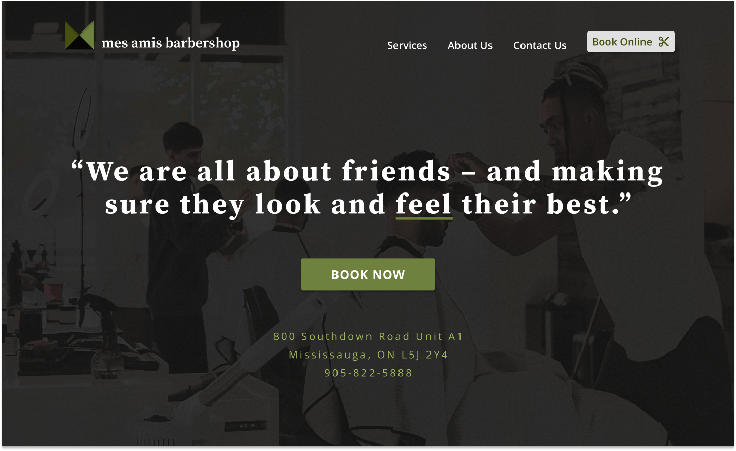
Mes Amis Barbershop
Responsive Website Design
A contemporary UX exploration of redesigning a local business website
Objective
Redesign a local business website by applying UX design principles and methodologies while navigating real-world constraints such as limited technical resources and budget considerations.
This project aims to deliver measurable user experience improvements that are both impactful for the business and feasible for implementation within a small business environment.
Team
Solo Project
Duration
71 Hours
Tools
Figma
Canva
Zoom
My Role
Research
Define
Design
Testing
Overview
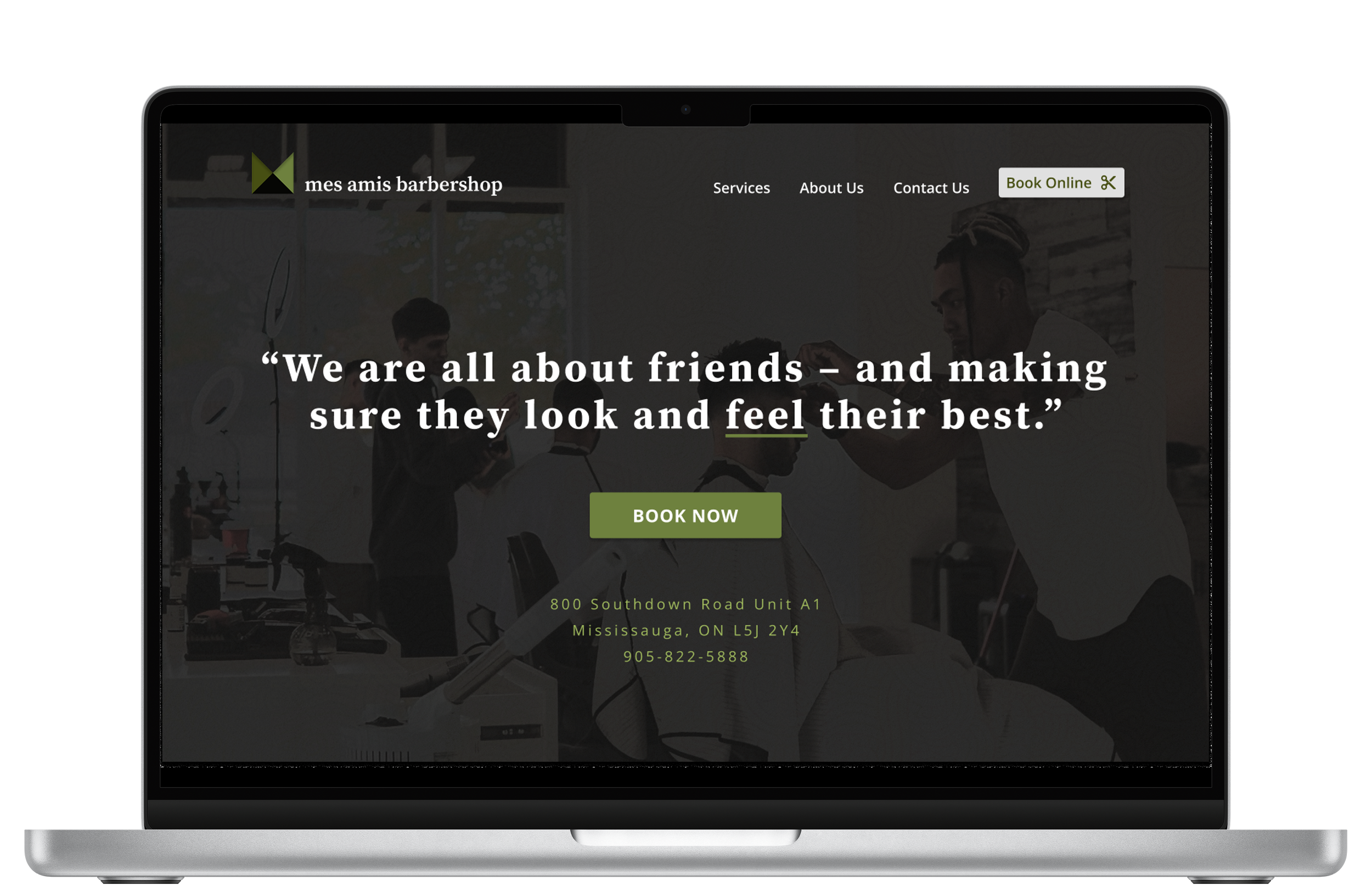
The current Mes Amis website suffers from an outdated aesthetic and fails to provide an adequate user experience on mobile devices. This positions it unfavourably when compared to the online presence of other competing local barber shops.
Furthermore, significant improvements are needed to ensure the site meets current web accessibility standards.
-
Competitive Analysis
User Interviews
While researching barbershops in the area, I found that many barber shops in the area did not even have a website but instead using their booking tool.
I chose similar barber shops based on their location and reviews. These barber shops serve a similar demographic and offer services customers are generally looking for in a barbershop.
Competitive Analysis
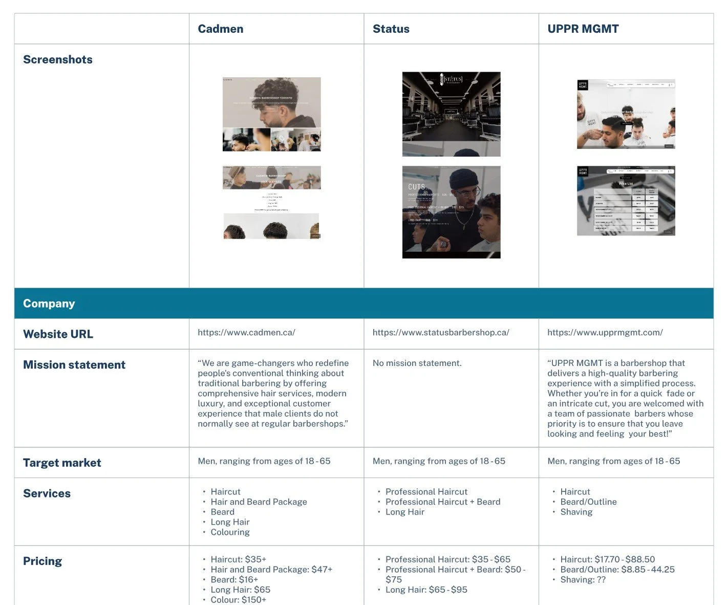
Click to view full image
I interviewed 6 individuals, both male and female, to understand their habits and what they value from barber and salon services.
I discovered that many participants booked online, while some booked on the spot in person. Also, many participants discovered services through referrals. However, if referrals were not an option many would turn to online to check for reviews and quality of work for a barber/salon service.
User Interviews
Discovery Combines Referrals and Online Search
Word-of-mouth recommendations from friends are a primary and trusted method for finding new providers.
Insights
Loyalty Driven by Quality, Relationships, and Convenience
Consistent, high-quality service is paramount for loyalty across all interviews.
Scheduling Preferences Vary
Users employ a mix of scheduling methods.
Online Presence Serves Multiple Roles
Online platforms are crucial for booking and research, as users rely on reviews to validate quality.
Price Sensitivity & Transparency Impacts Decisions
Some users prioritize quality and relationships above cost.
How might we provide clear and trustworthy online information that enables men to confidently assess a barbershop's suitability for their hair type and desired cut?
Problem Statement
-
Personas
Storyboard
Feature Set
Sitemap
User Flows
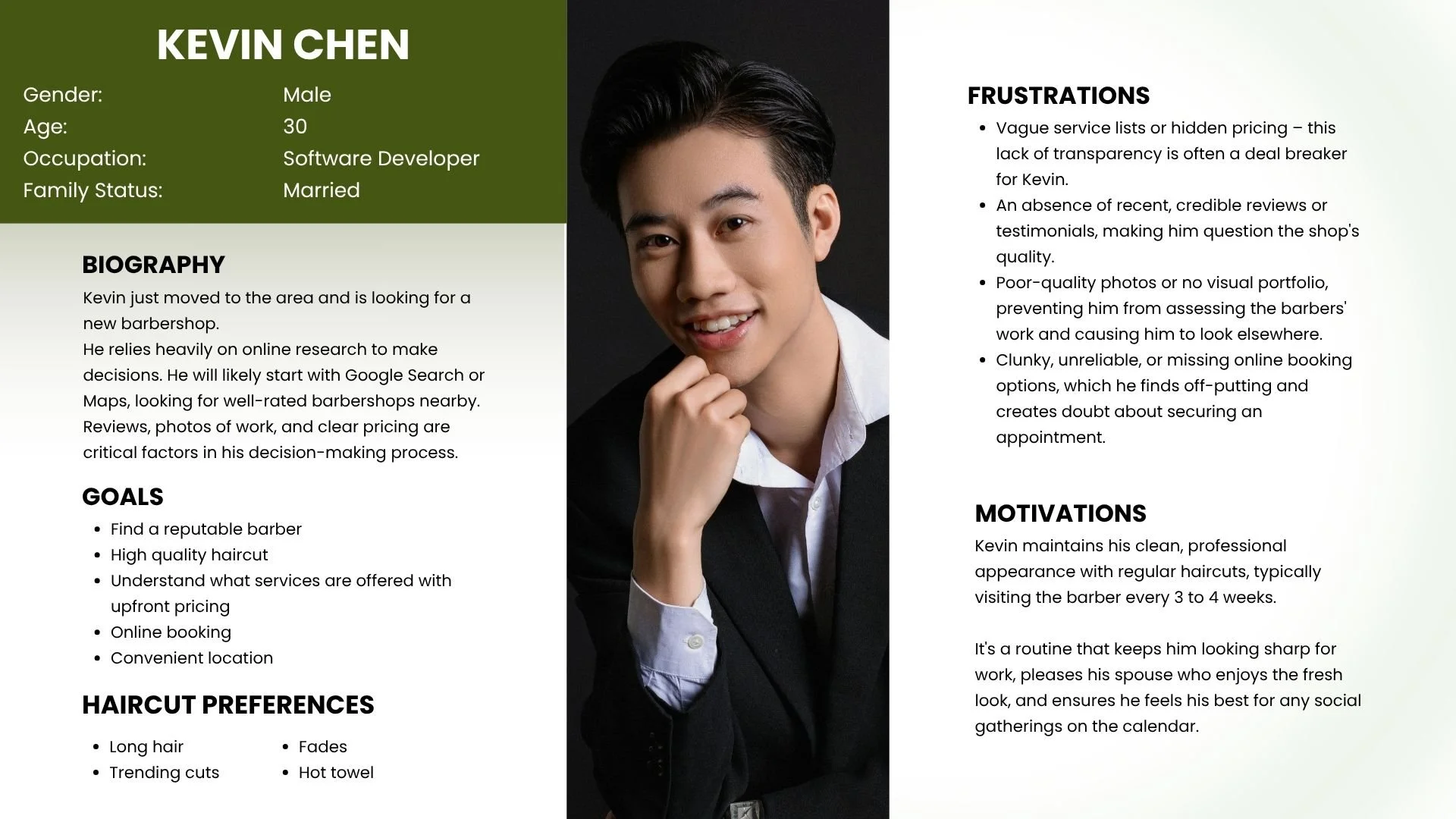
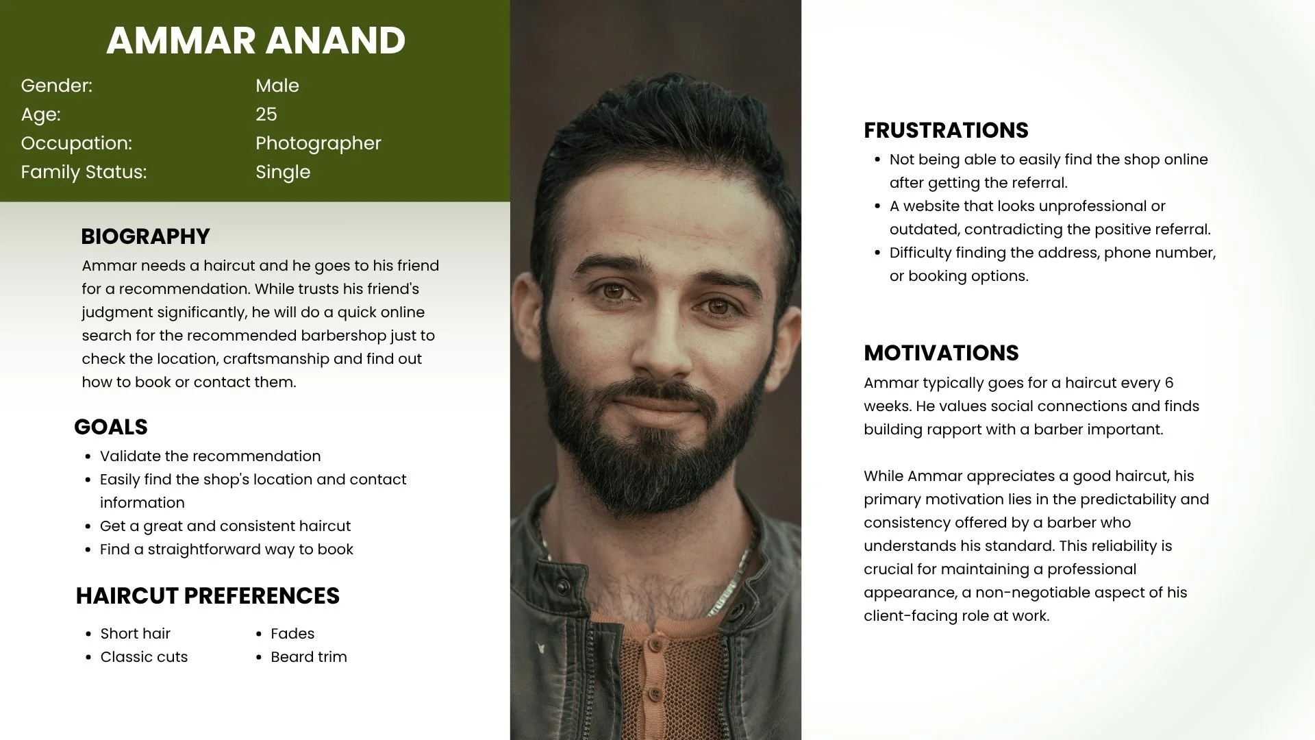
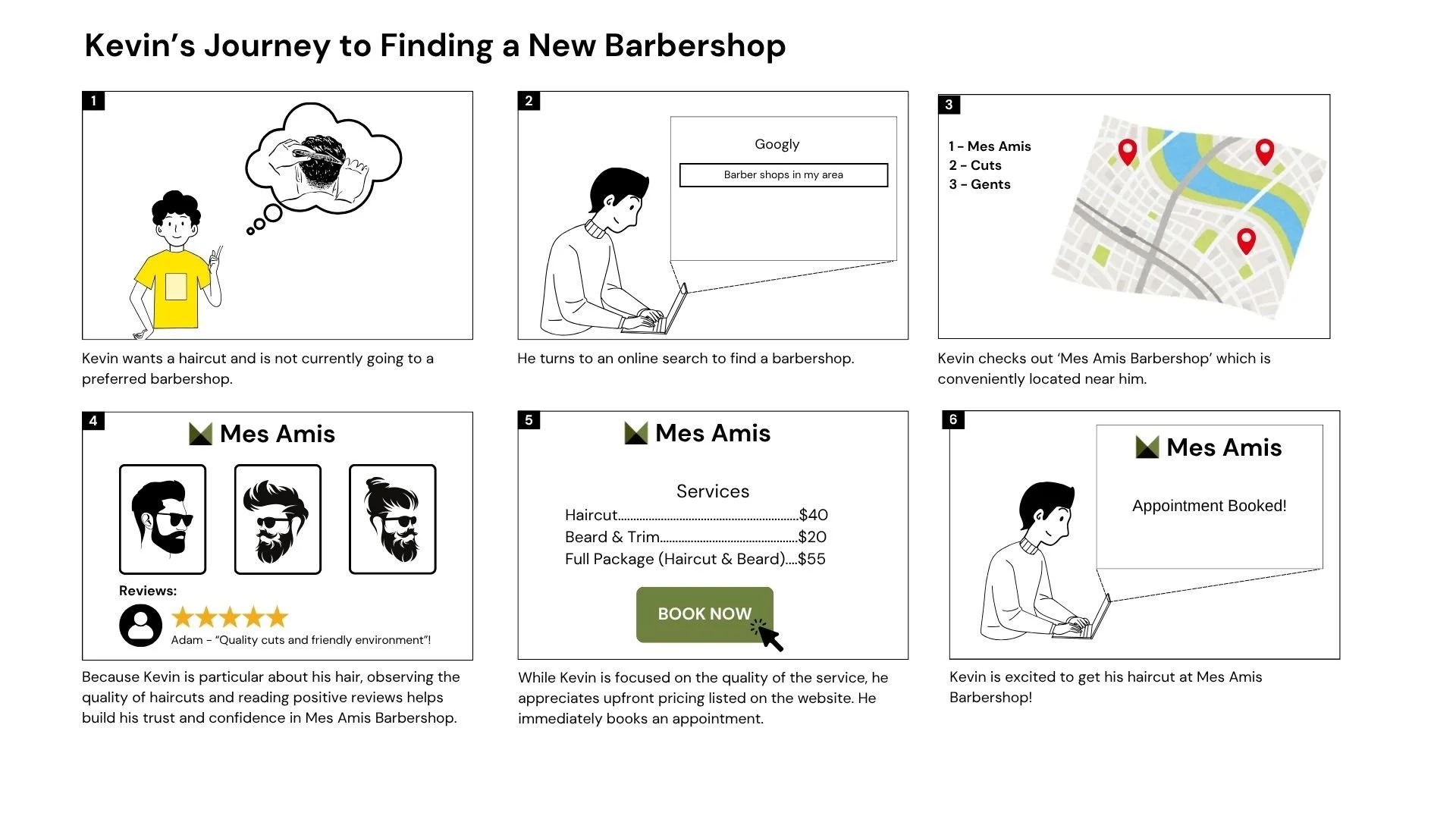
Based on my research insights, I developed two personas representing the primary user groups.
Personas
Storyboard
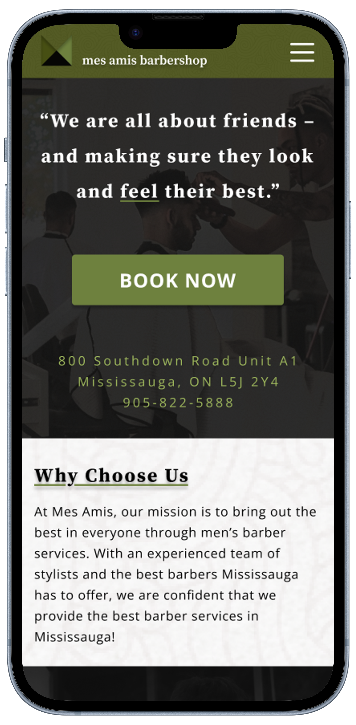
Using the persona of Kevin, I created a storyboard to visualize his journey in finding a new barbershop. Before booking, he thoroughly reviews the shop's high-quality portfolio images, customer reviews, and upfront pricing.
Feature Set

My plan is to redesign the entire website, integrating high-quality barber portfolios, transparent upfront pricing, reviews, and convenient contact methods. The existing booking tool will remain untouched.
Click to view full image
Sitemap
To better understand the Mes Amis website's structure, I developed a sitemap that will guide the creation of user flows.

Click to view full image
User Flows

I mapped out user flows to show how might my persona navigates the shop's website, specifically for: booking a haircut, researching services, evaluating service and professional quality, and confirming contact information. As stated earlier, the actual booking occurs through a separate widget.
Click to view full image
-
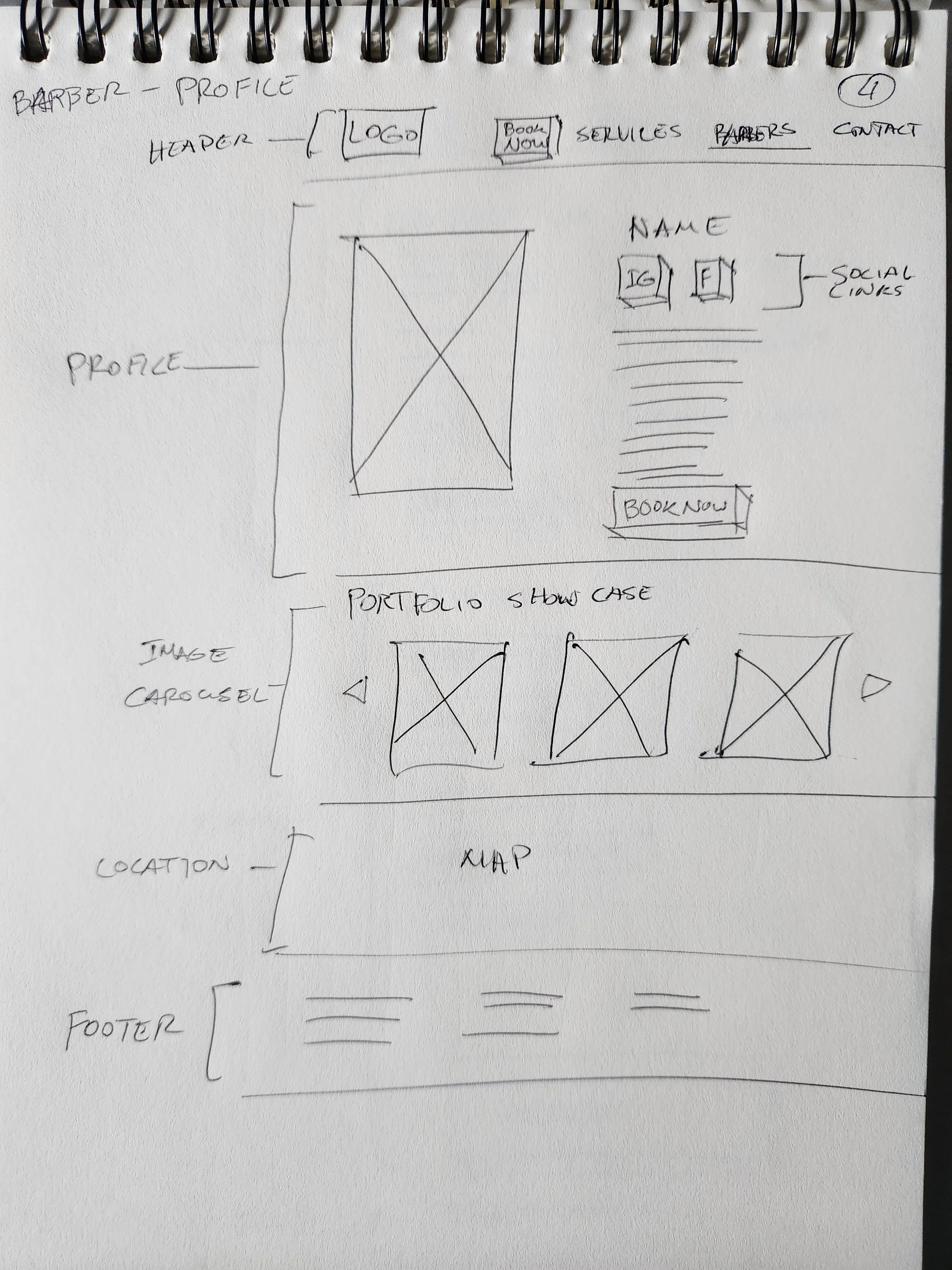
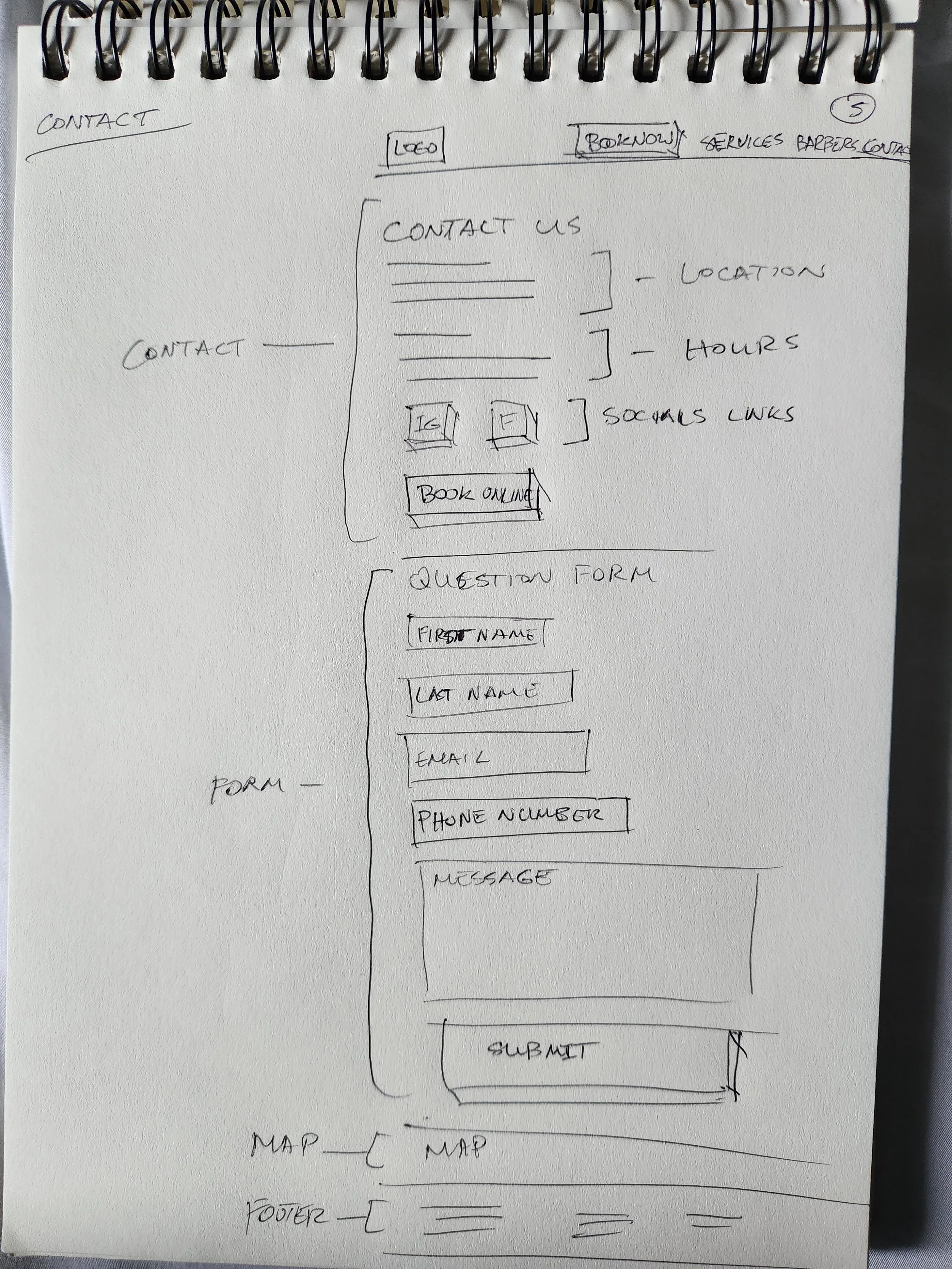
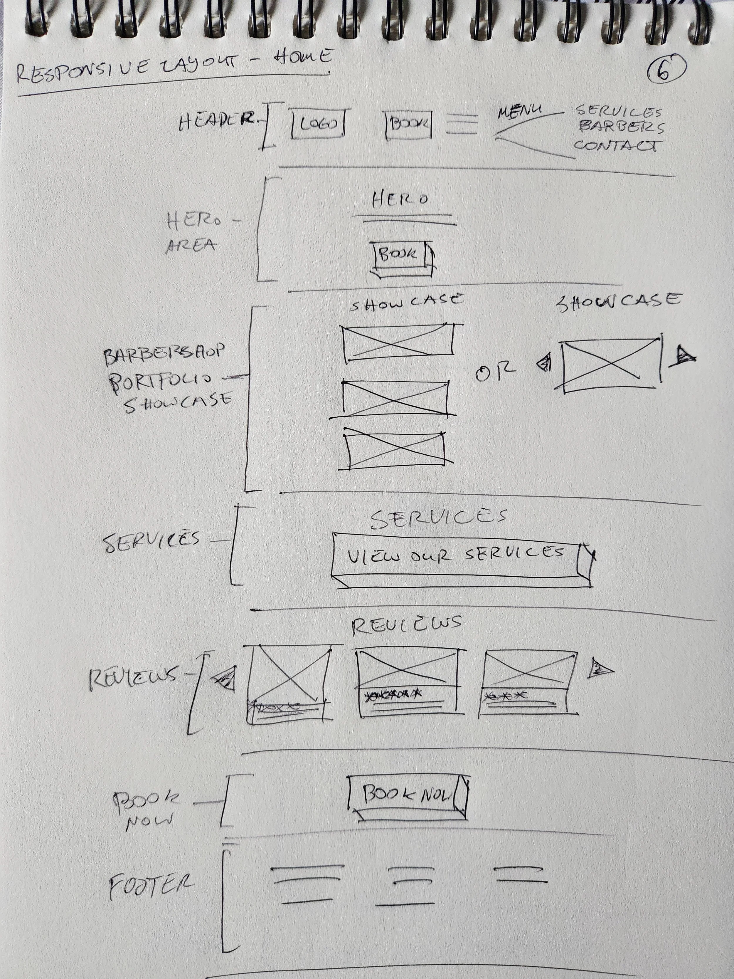
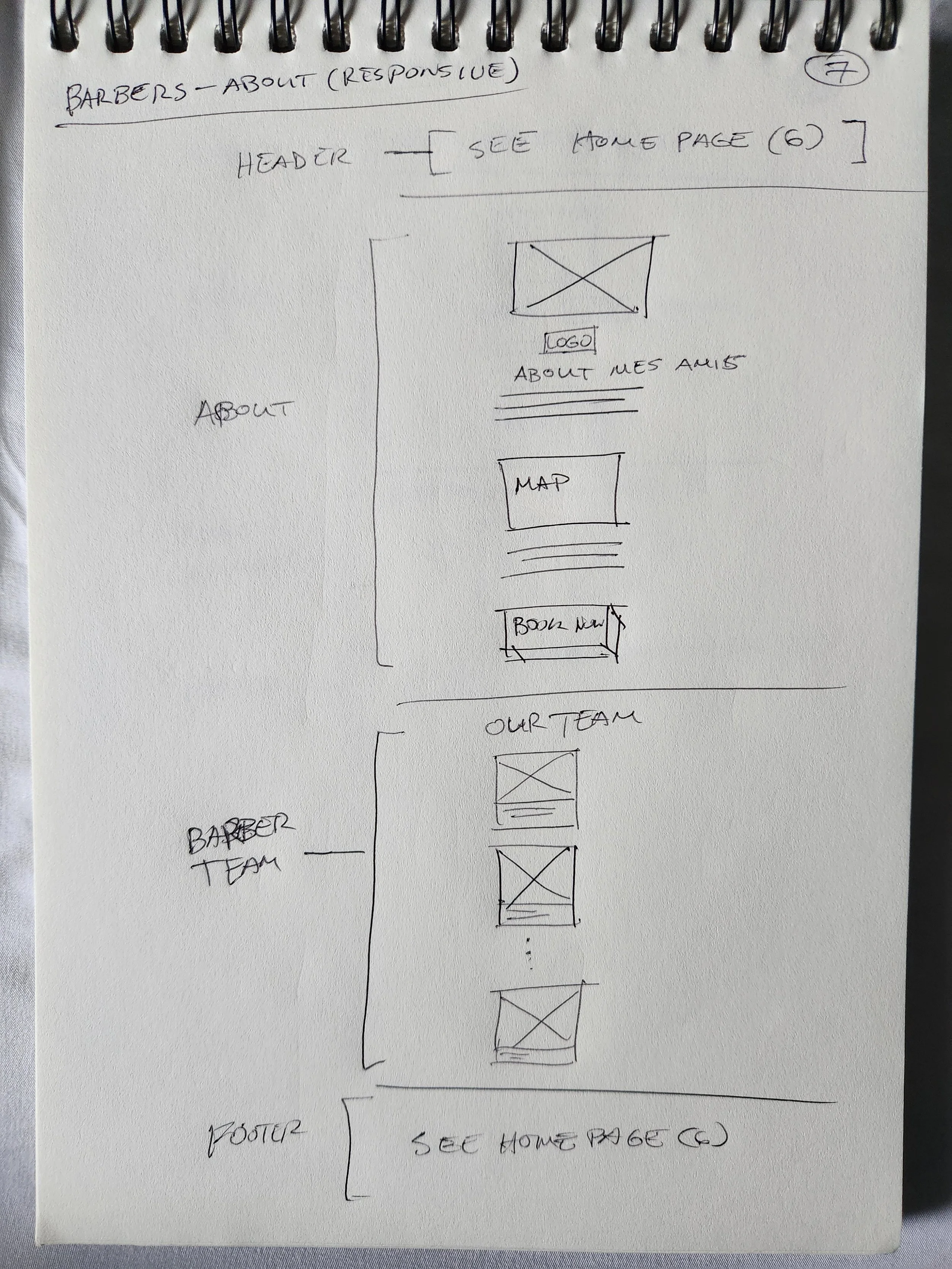
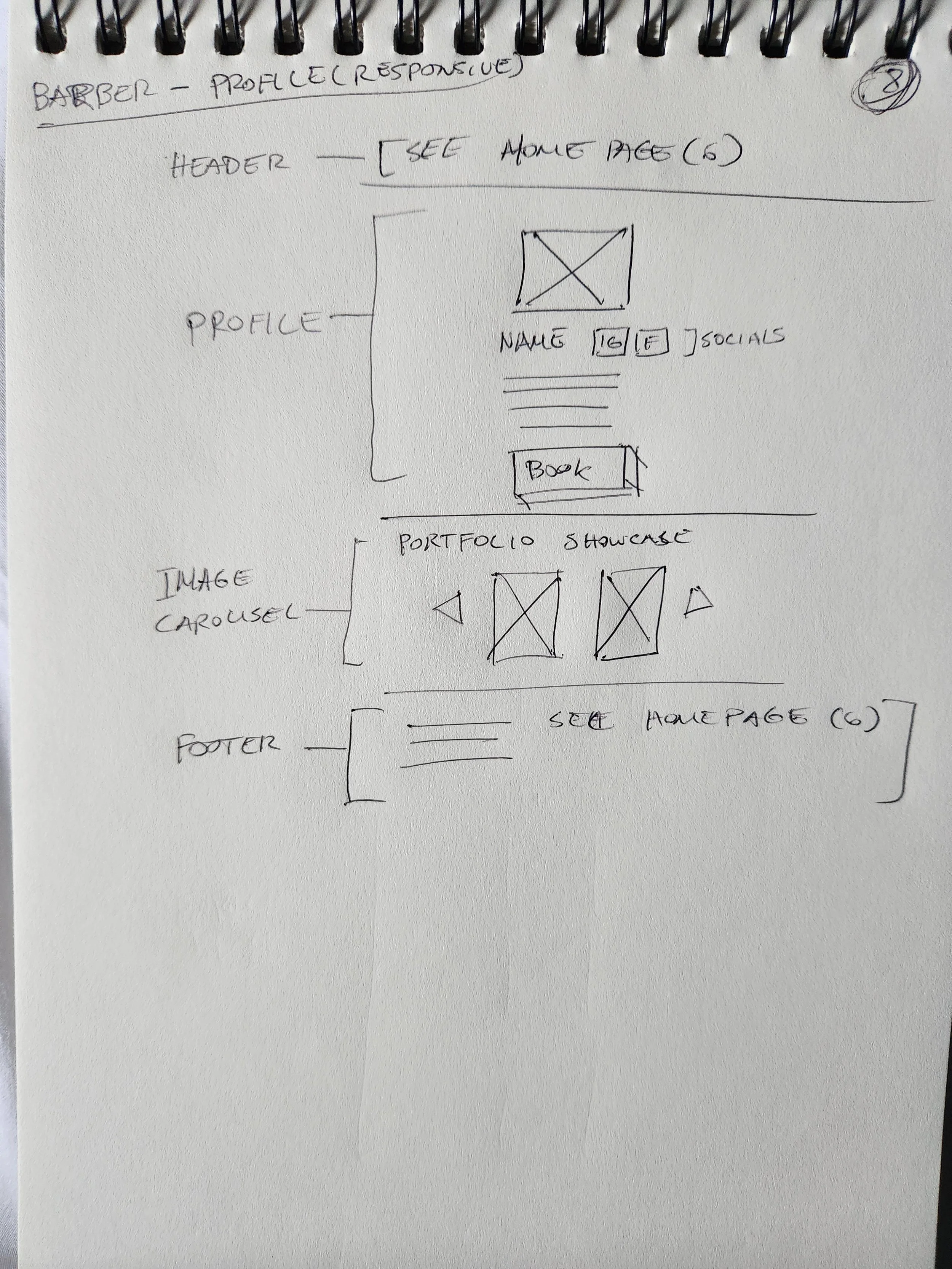
Low-Fidelity Wireframes
Mid-Fidelity Wireframes
Branding
High Fidelity Wireframes
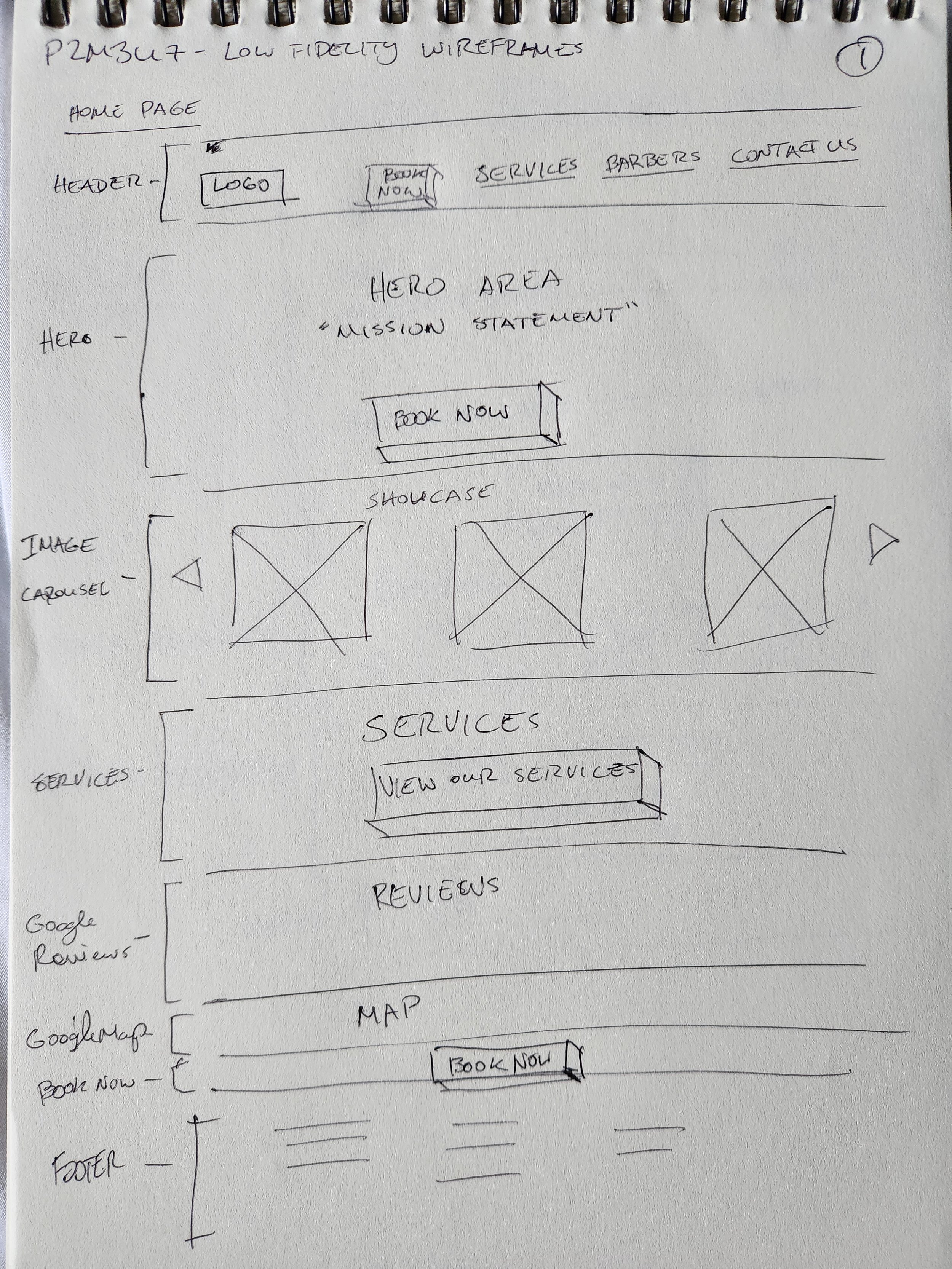
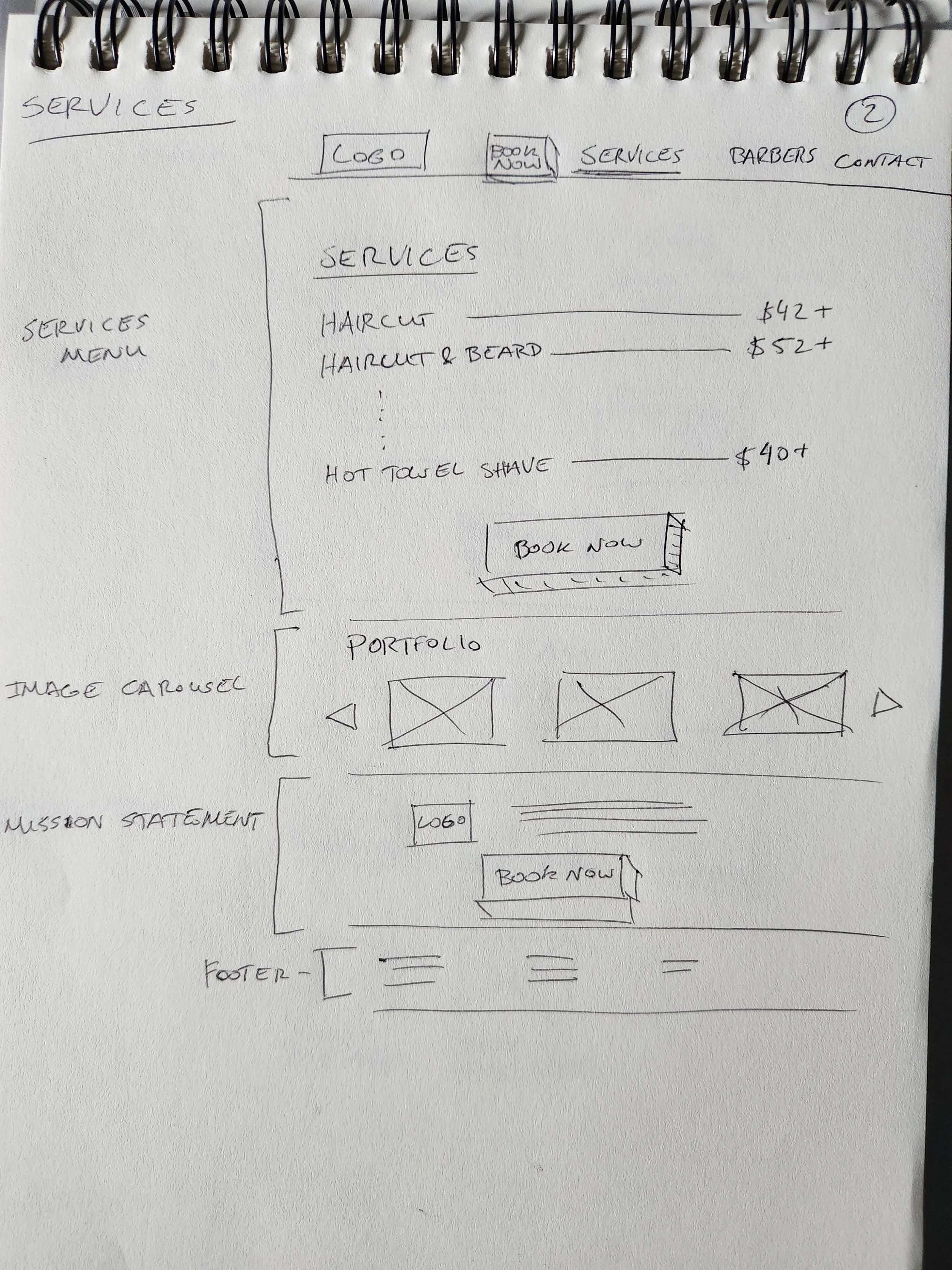
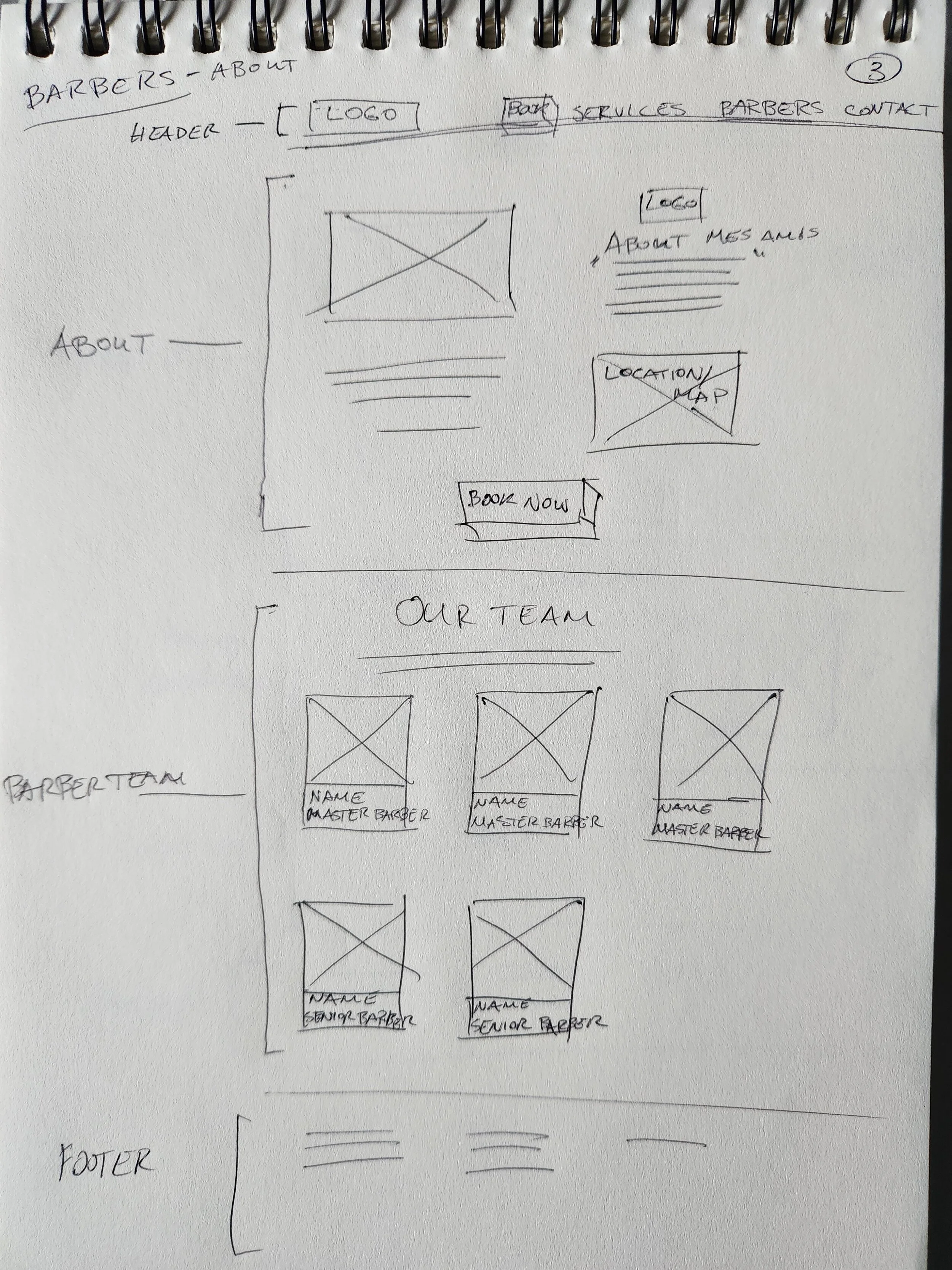
I began by sketching initial product components, integrating key elements from the sitemap and user flows. This process allowed me to explore various layouts before digitizing the selected designs.
Low-Fidelity Wireframes
-
![]()
Home
-
![]()
Services
-
![]()
About
-
![]()
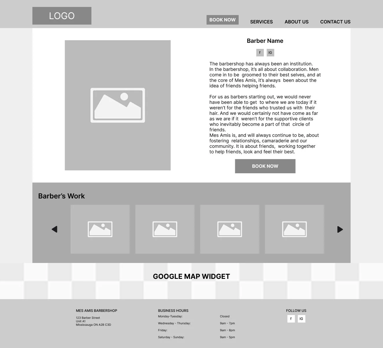
Barber Profile
-
![]()
Contact
-
![]()
Home (Mobile)
-
![]()
About (Mobile)
-
![]()
Barber Profile (Mobile)
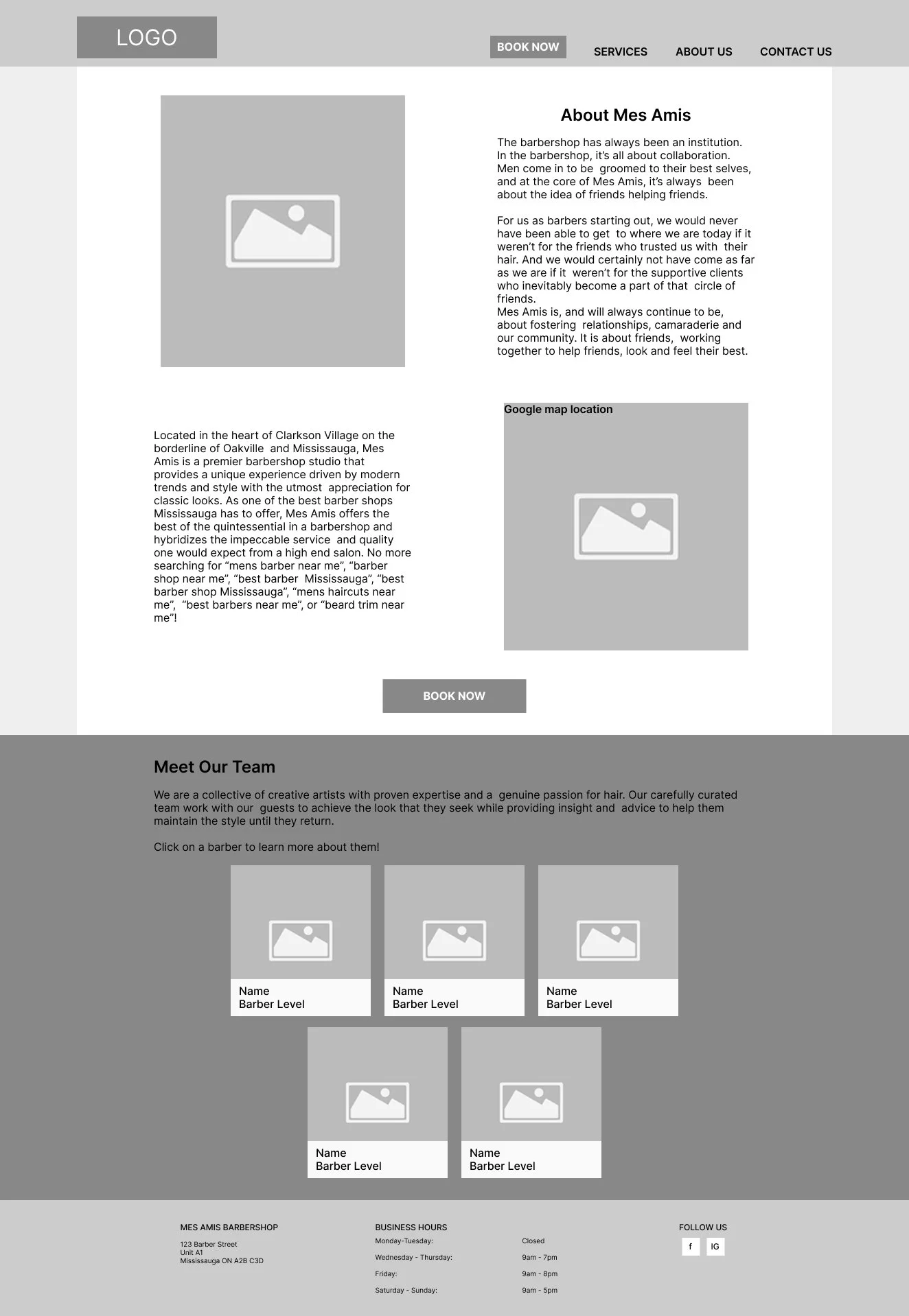
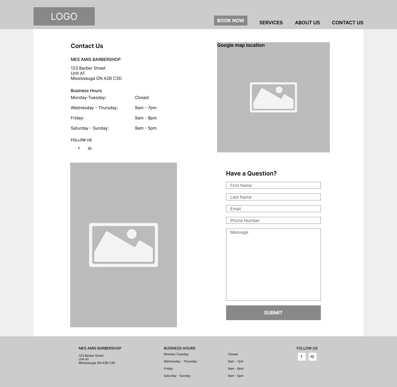
Mid-Fidelity Wireframes
I focused on positioning and sizing, using existing copy text to accurately scale elements. Due to the content's natural flow, I merged the home and services pages into one for a more cohesive user experience.
-
![]()
Home
-
![]()
About
-
![]()
Barber Profile
-
![]()
Contact
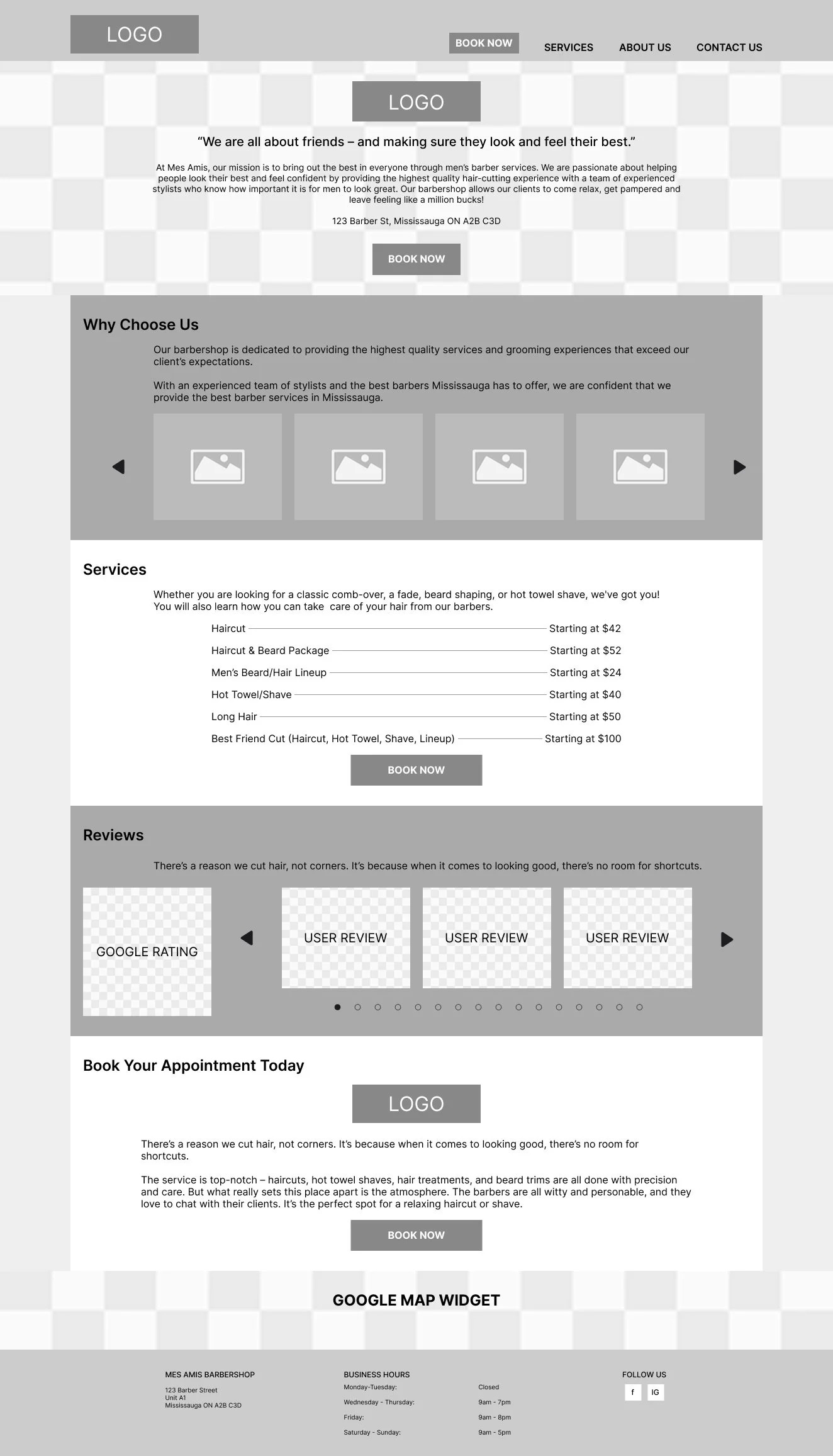

I preserved the original aesthetic while enhancing professionalism through the use of Open Sans typography and brand-aligned keywords derived from content analysis.
Branding
Click to view full image
I curated images from the original site and enhanced them with carefully selected effects and textures to create a more sophisticated aesthetic.
This process involved strategically applying filters, overlays, and textural elements that complemented the existing brand identity while elevating visual impact.
The result was a cohesive design system that maintained brand consistency while achieving a polished, professional appearance reflecting the barbershop's quality and values.
High-Fidelity Wireframes
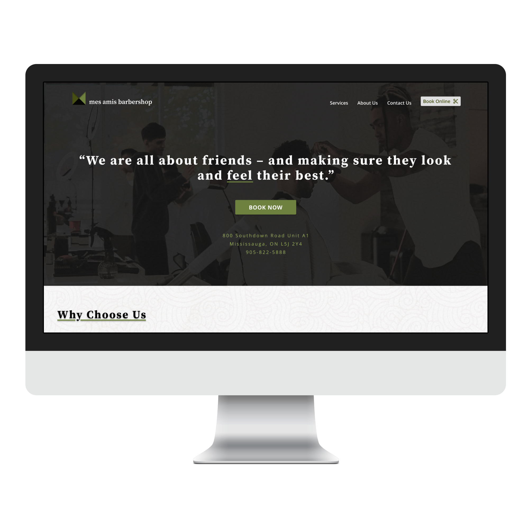
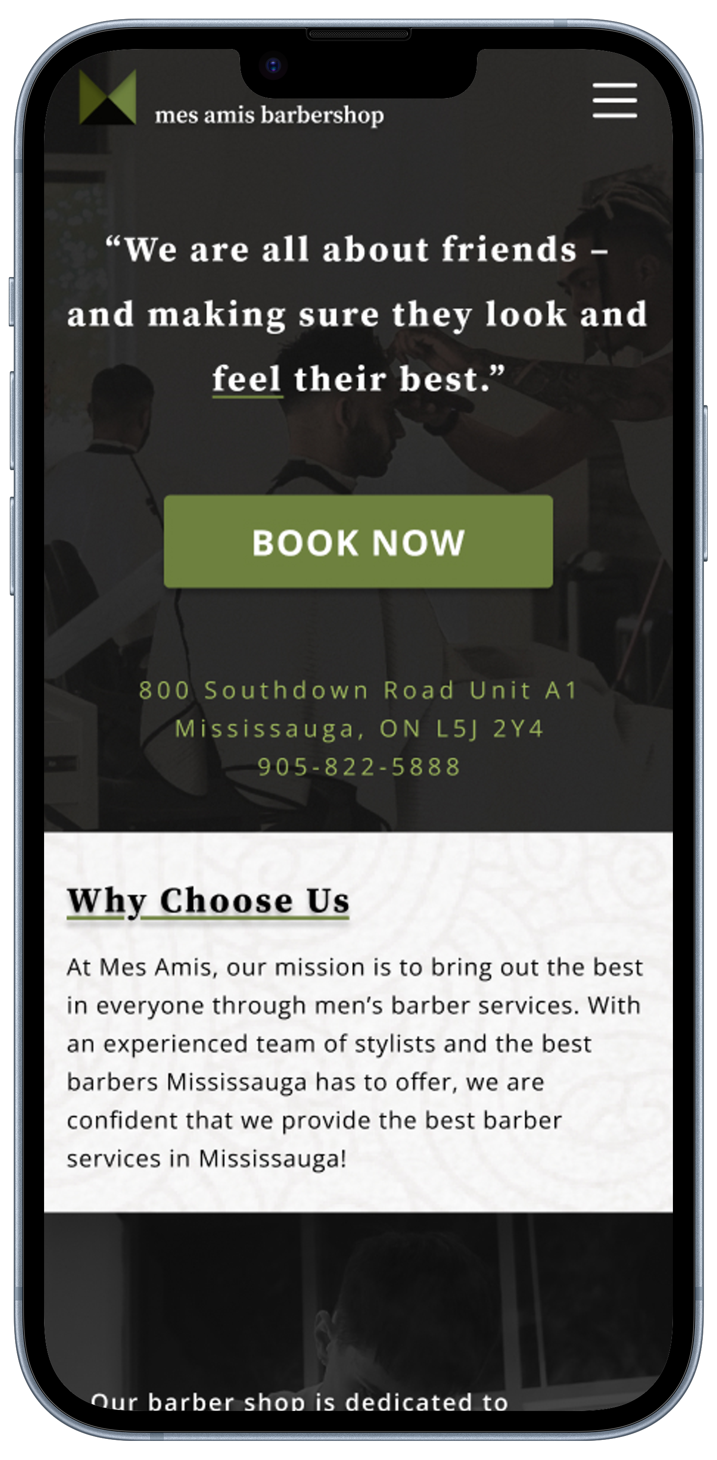
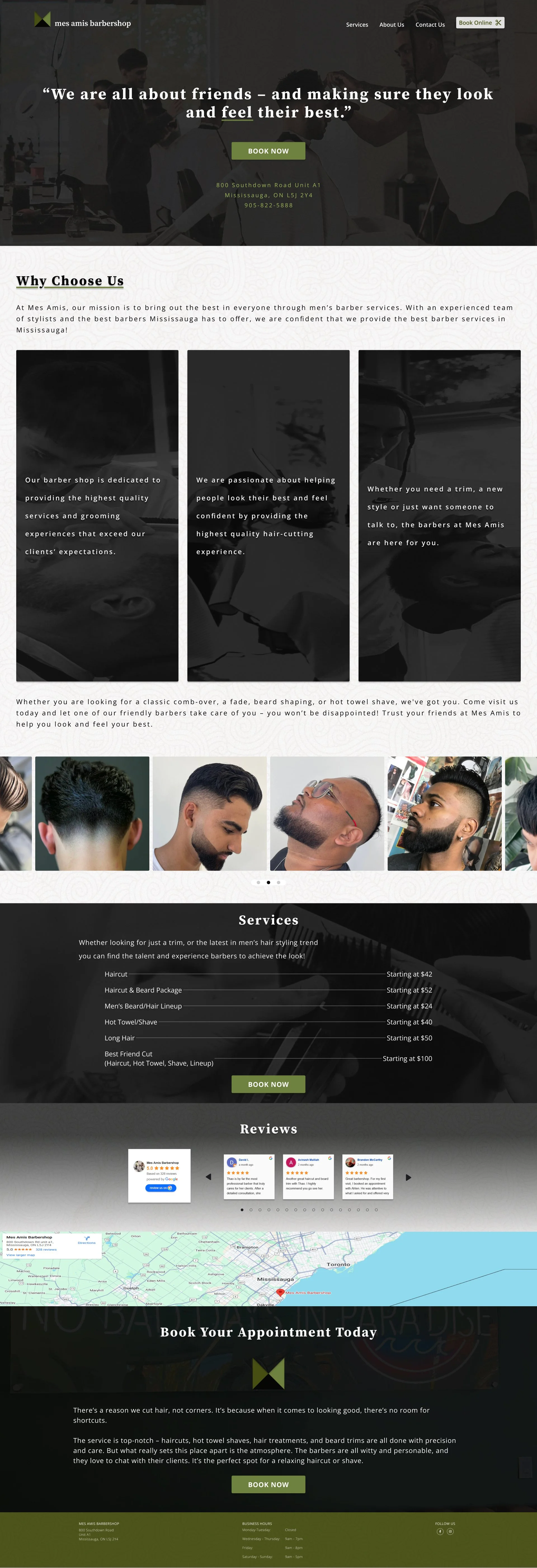
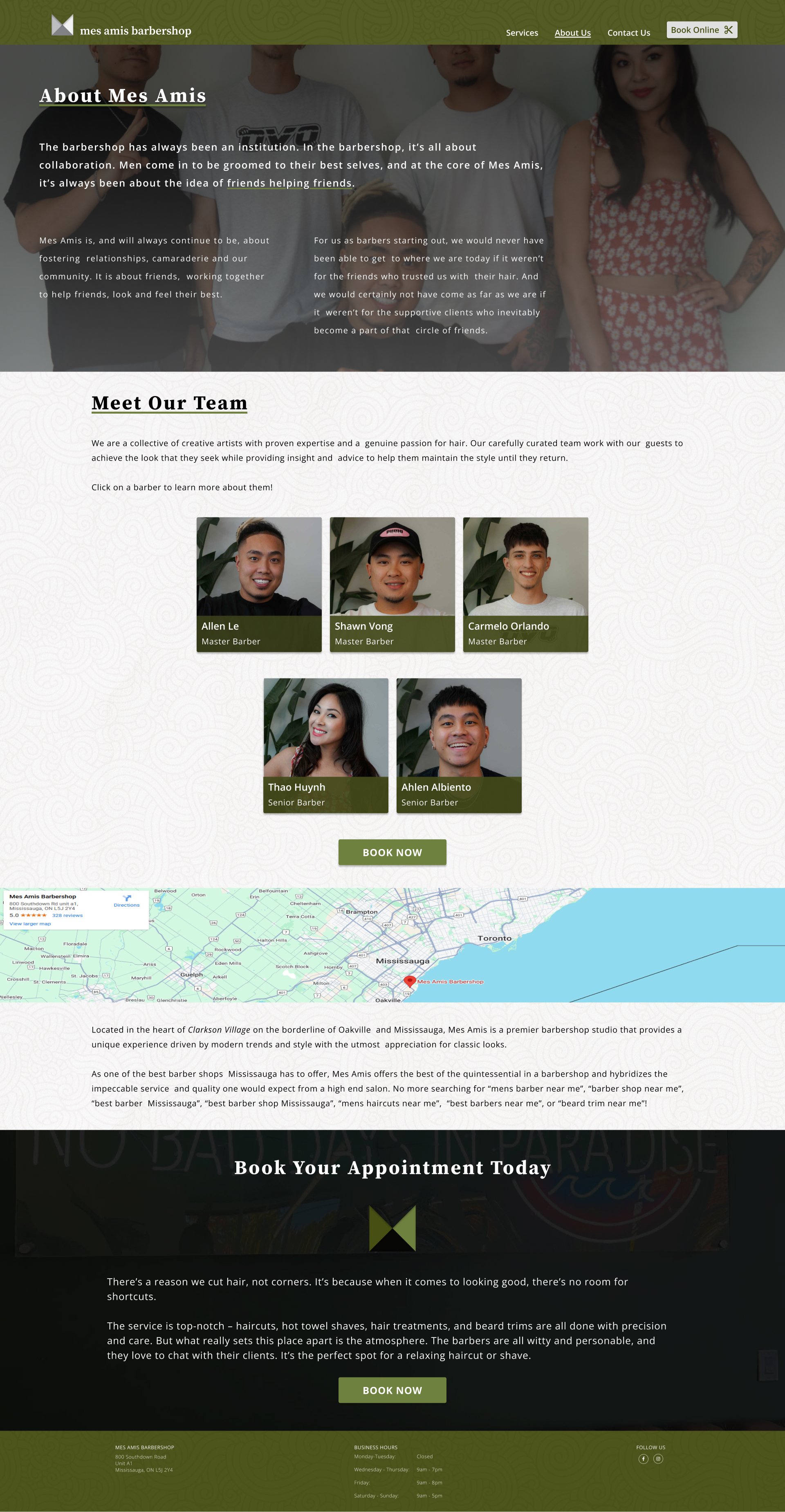
About page
Home page
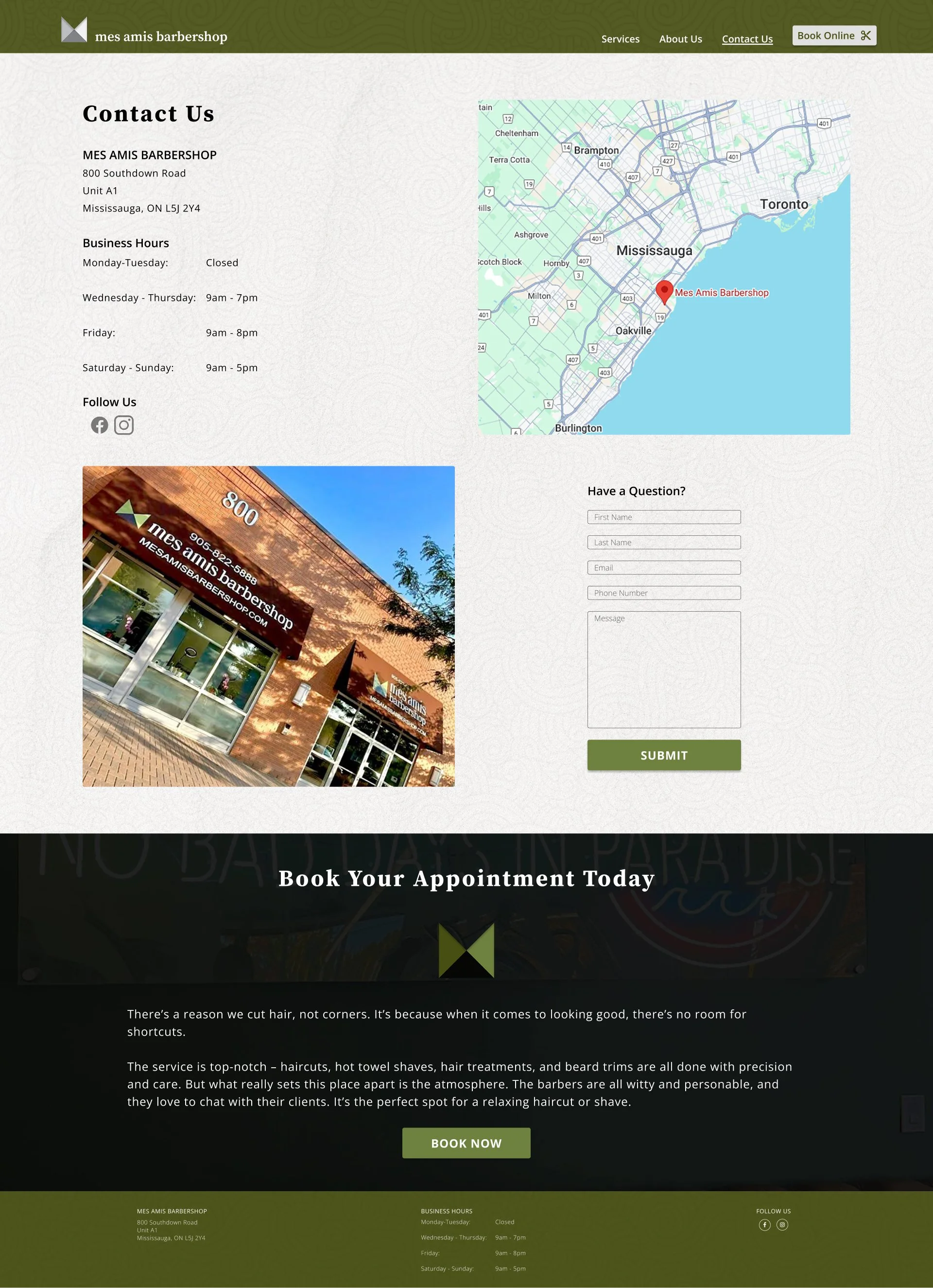
Contact page
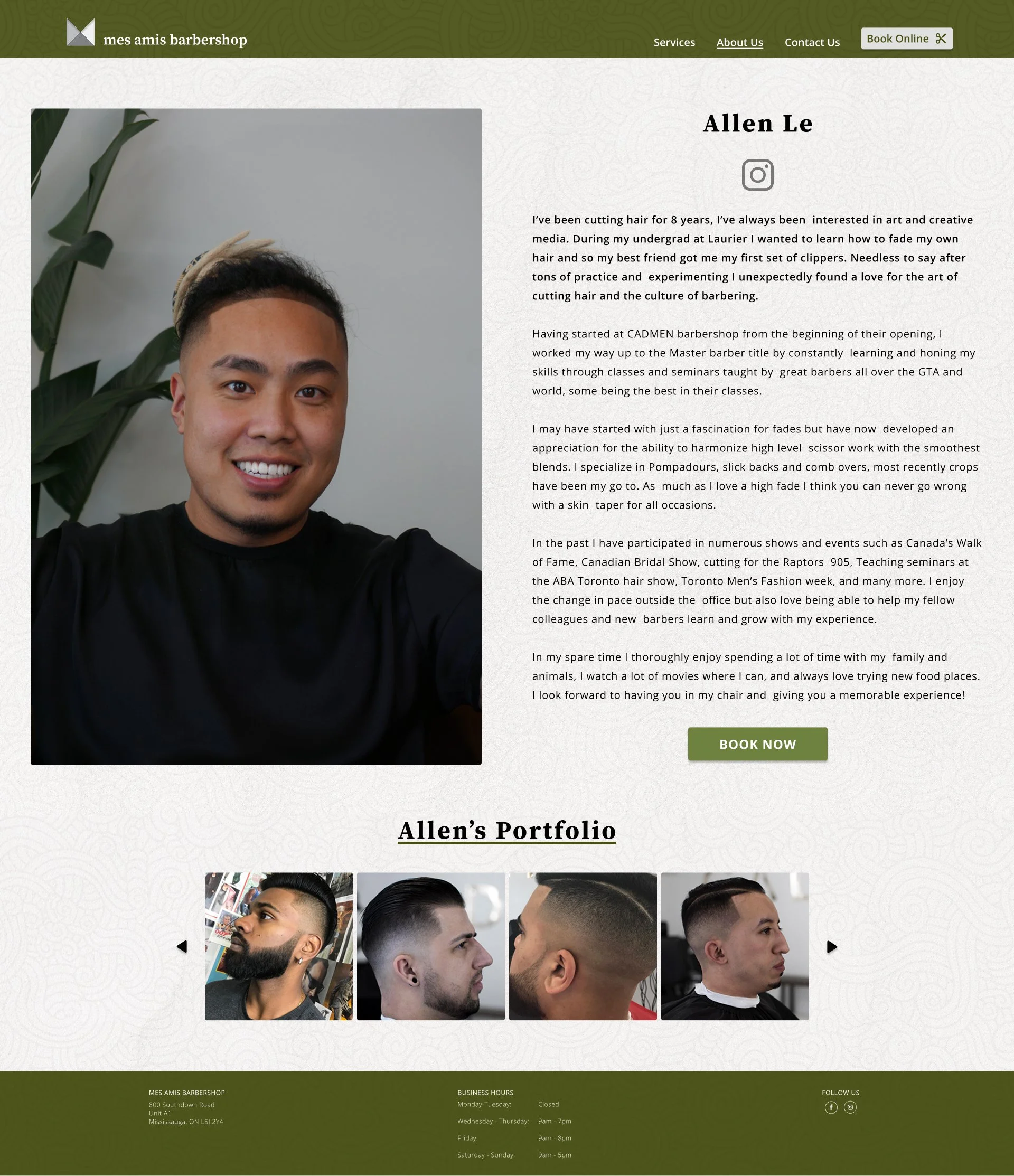
Barber Profile page
-
Usability Testing
Iterations
Reflections/Next Steps
Prototype
I conducted usability testing with 5 participants using a Figma prototype for the Mes Amis barbershop website redesign.
All participants achieved a 100% completion rate across three key tasks:
Navigating the homepage to find the shop’s information, services, and work quality
Exploring the "About Us" page and barber profiles
Accessing the "Contact Us" page
While the results demonstrate strong overall usability, several areas for improvement were identified, including menu behaviour and content placement optimization to enhance functionality and user experience.
Usability Testing
Key Successes ✅
Ease of Navigation: Users found the website simple and easy to navigate.
Accessible Services List: The list of services and prices was easily found and considered useful.
Clear Layout: The overall layout was considered good and effective.
Prominent Booking Button: The placement of the "Book Now" button was appreciated, particularly by returning customers.
Informative Barber Profiles: Users liked seeing information about the barbers, including pictures, details, and social media links.
Critical Issues to Address ⚠️
Services menu (mobile): Fix auto-close behaviour on navigation and add clear close button.
Service details: Add comprehensive descriptions using hover effects or expandable sections.
"Book Now" buttons: Reduce frequency and strategically place after key content sections.
Homepage hierarchy: Prioritize services, reviews, and contact information higher on the page.
Content length: Shorten text for better readability, especially on homepage.
I retained the current frequency of "Book Now" buttons as they are essential for customer conversion.
The three buttons—positioned in the hero section, services area, and footer—are strategically placed and appropriately spaced. Future testing will provide additional insights into their effectiveness.
I addressed the most critical issues across both desktop and mobile versions where applicable and created a comprehensive change log to document all revisions for future reference.
Revisions
Change Log - Desktop
Services_mobile_v2
Added ‘x’ to the top right of the frame
This should help to indicate and guide the user where the window can be closed
Change font weight from ‘light’ to ‘regular’ for the type of service text and cost text
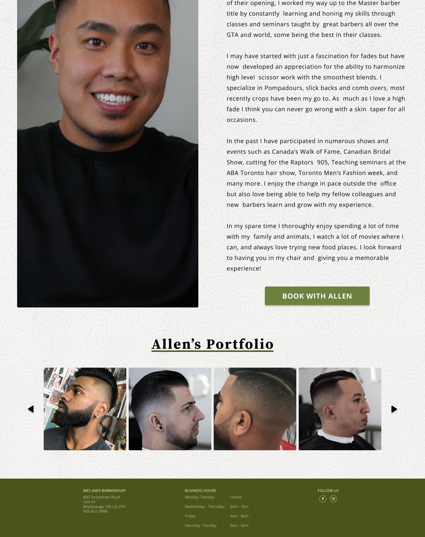
AboutUs_Profile_Allen_Mobile
Changed ‘BOOK NOW’ to ‘BOOK WITH ALLEN’
AboutUs_Profile_Shawn_Mobile
Changed ‘BOOK NOW’ to ‘BOOK WITH SHAWN’
AboutUs_Profile_Carmelo_Mobile
Changed frame name from ‘AboutUs_Profile_Carmello_Mobile’ to ‘AboutUs_Profile_Carmelo_Mobile’
Changed ‘BOOK NOW’ to ‘BOOK WITH CARMELO’
Fixed typo in Carmelo’s name
Change Log - Mobile
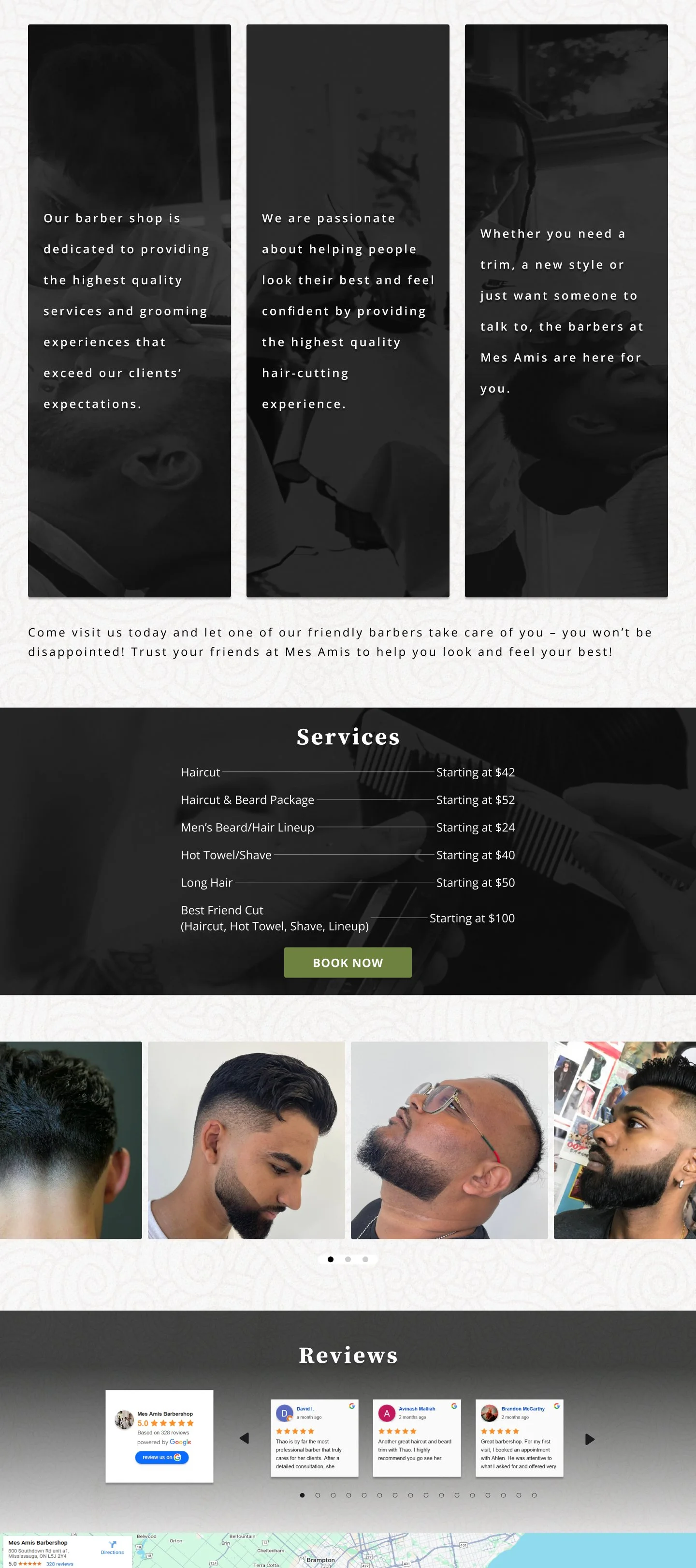
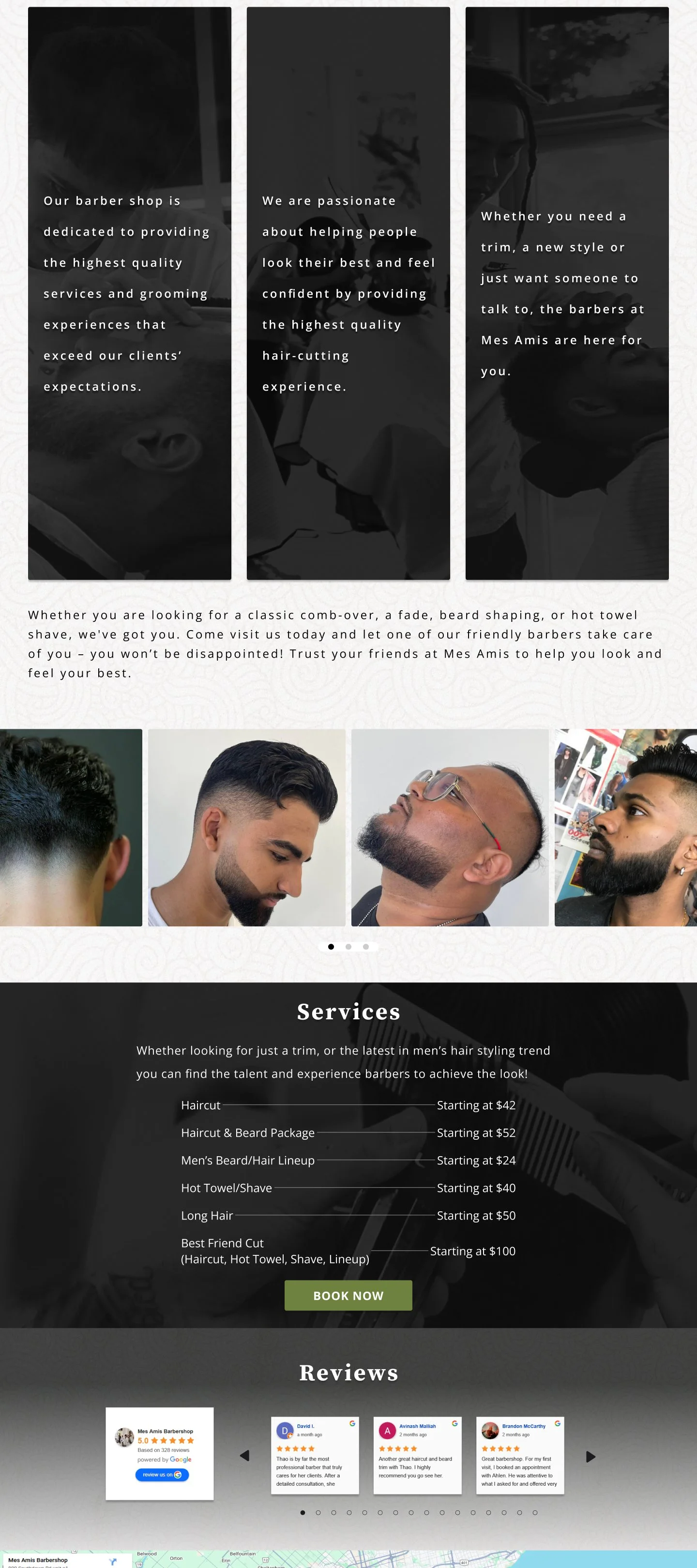
HomePage_v3
Moved ‘Services’ section above ‘Gallery’
Removed text in ‘Services’ frame
Adjusted padding around Gallery frame
AboutUs_Profile_Allen
Changed ‘BOOK NOW’ to ‘BOOK WITH ALLEN’
AboutUs_Profile_Shawn
Changed ‘BOOK NOW’ to ‘BOOK WITH SHAWN’
AboutUs_Profile_Carmelo
Changed ‘BOOK NOW’ to ‘BOOK WITH CARMELO’
AboutUs_Profile_Thao
Changed ‘BOOK NOW’ to ‘BOOK WITH THAO’
AboutUs_Profile_Ahlen
Changed ‘BOOK NOW’ to ‘BOOK WITH AHLEN’
-
AboutUs_Profile_Thao_Mobile
Changed ‘BOOK NOW’ to ‘BOOK WITH THAO’
AboutUs_Profile_Ahlen_Mobile
Changed ‘BOOK NOW’ to ‘BOOK WITH AHLEN’
Home_Mobile
Removed text ‘Whether you are looking for a classic comb-over, a fade, beard shaping, or hot towel shave, we've got you.’
Removed text ‘Whether you are looking for a classic comb-over, a fade, beard shaping, or hot towel shave, we've got you.’
Moved ‘Services’ section above ‘Gallery’
Change font weight from ‘light’ to ‘regular’ for the type of service text and cost text
Figure 1 - Original
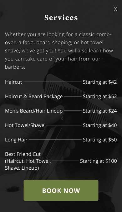
Figure 2 - Revision
⚠️ Problem (Figure 4):
On the homepage, prioritize services, reviews, and contact information higher on the page.
Shorten text for better readability, especially on homepage.
✅ Solution (Figure 5):
Re-positioned the services section above the gallery.
Condensed homepage text to improve readability.
Figure 4 - Original
Figure 5 - Revision
⚠️ Problem (Figure 6):
In each barber’s profile, the ‘Book Now’ button is unclear if booking with a specific barber.
✅ Solution (Figure 7):
Added barber’s name to the button for better clarity.
Figure 6 - Original
Figure 7 - Revision

✅ Solution (Figure 2):
Added a close button ‘X’ to the top right corner. Addressed the auto-close behaviour.
⚠️ Problem (Figure 1):
Fix auto-close behaviour on navigation and add clear close button.
Key Takeaways
I discovered the critical importance of developing a structured project plan and consistently tracking progress through task timing and completion dates, which maintained accountability and ensured steady momentum.
I challenged myself to explore diverse design approaches, experimenting with textures, layouts, contrast adjustments, and sizing variations to significantly enhance my design capabilities.
Weekly mentor check-ins were essential for maintaining project alignment and meeting submission deadlines.
Supporting a Local Business
I found it particularly rewarding to contribute to a local business I regularly visit. The research process was equally engaging, involving comprehensive analysis and comparison of design approaches across similar local establishments.
Surprising Research Findings
During my research, I discovered that some barbershops lacked websites entirely, while those with online presence consistently utilized third-party booking systems. Barbershop websites primarily served to showcase workmanship, detail services, and provide contact information.
Content and Organization Challenges
The initial material contained substantial text blocks that were essential for communicating service value. I preserved select aspects of the original content to maintain brand consistency while strategically reorganizing information for better user experience.
Design and Layout Challenges
I navigated complex decisions around layout structure and visual elements, balancing preservation of brand identity with modern design improvements. My final design emerged through thoughtful application of textures, varied layouts, strategic contrast, and intentional sizing choices.
Reflections
I'm proud of both this design and my overall UX journey.
Reflecting on my growth, I'm excited to continue developing my skills. For this project, my next steps include:
Social media integration for barber portfolios
Brand redesign exploration
Homepage enhancement with animations or 3D elements to elevate user experience
Ongoing usability testing to validate button placements, changes and identify emerging issues